|
|
|
Showing 171 - 180 of ~337 |
| Image |
Comment |
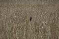
| 04/27/2005 05:06:21 PM | All Aloneby Cy1971Comment: I think a brighter picture would offer better contrast to the bird, but nice idea. 6 |
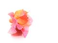
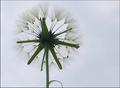
| 04/27/2005 05:05:17 PM | just a little bitby FyzarlComment: Not sure if this suits the challenge. If you can recall, one of the ribbon winners for white-on-white, the one with the two swans, reminded me of this, and would replace this image nicely to fit in this challenge. I like, don't get me wrong, the image, but I think the subject is too large, to be, mini. 5 |  Photographer found comment helpful. Photographer found comment helpful. |
| 04/27/2005 05:03:12 PM | Riverside Laundryby desertdocComment: Lose the border. I guess the intention subject is obviously the people doing laundry, which, if you hadn't told me so, I wouldn't have a clue. It's a good thing that the women is wearing a bright colour, otherwise, the tree would dominate the photo, which it is also almost doing right now, and then this wouldn't be minimalism. I don't think I like this one. I like the idea, but a flat horizon, or a single-sbject that is stronger in the frame than the one here, would suit the idea better, i think. 4 | | Photographer found comment helpful. |
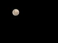
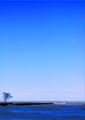
| 04/27/2005 05:00:18 PM | Moon Riseby AlanBesComment: Fits the challenge perfectly! There was a full moon a few days ago here as well. Maybe you'r from around here. Or not, i dunno. Nice though, 7. |
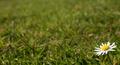
| 04/27/2005 04:59:04 PM | Lonely Daisyby MudHutComment: A little on the cliché side, but as well, a good representation of a cliché. greener grass would be nice. 6 | | Photographer found comment helpful. |
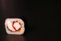
| 04/27/2005 04:58:05 PM | My Little Sushiby rlinn3Comment: Nice comp. but I think shooting the sushi not directy at the light source would eliminate the small glare the the white parts of the fish reflect. nice. 5 | | Photographer found comment helpful. |
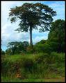
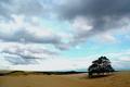
| 04/27/2005 04:56:50 PM | Standing Strongby beamsclanComment: Nice, it would be better if the clouds were not so dark, because they almost act as a second subject, and detract the attention away from the tree. Maybe a smaller crop to eliminate the grass on the left side as well would be good. A little too dark shadows and a little to light highlights. Needs less contrast perhaps. Good try though, 4 | | Photographer found comment helpful. |
| 04/27/2005 04:54:17 PM | | | Photographer found comment helpful. |
| 04/27/2005 04:53:37 PM | Theory of Relativityby flip89Comment: Was there a substantial filtering effect used on this image, or a physical filter put infront of the lens to substantially alter the image? Either that, or the change in hues or tints detracts from the idea of this image, which, and sorry for my lack of theory-based knowledge, is unclear to me. Is the plane supposed to be the subject, or the tree, or the person, which I think it is. There is an uncertainty that does not help this image. The subject should be clear and consise, and stands out from the rest of the image. Too blue. 2 |
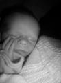
| 04/27/2005 04:50:35 PM | Daddy's Sonby davidphotographyComment: Cute, but struggles to meet the challenge. Perhaps if one eye was open, and the title suggests that the eye was the focus. A little too blurry as well, for me. 2 | | Photographer found comment helpful. |
|
Showing 171 - 180 of ~337 |
Home -
Challenges -
Community -
League -
Photos -
Cameras -
Lenses -
Learn -
Help -
Terms of Use -
Privacy -
Top ^
DPChallenge, and website content and design, Copyright © 2001-2025 Challenging Technologies, LLC.
All digital photo copyrights belong to the photographers and may not be used without permission.
Current Server Time: 08/20/2025 06:08:19 AM EDT.
|