| Image |
Comment |
| 10/11/2005 11:30:02 AM |
Rainy Daisy Days by CNovackComment: VEry nice! really makes you look back for those April showers. Would have liked just a touch more sharpness to the grass and flowers. Very good and should score up near the top Congrats. |
 Photographer found comment helpful. Photographer found comment helpful. |
| 10/11/2005 11:26:54 AM |
...Happy Anniversary Keturahby saloonstudiosComment: Now this is a great photo. It really tweks a persons imagination. The decaying boards in background add an extra nice touch to this shot. Lighting is as close to perfect as you can get. Extremely well done. Deserves a ribbon finish. |
| Photographer found comment helpful. |
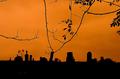
| 10/11/2005 11:23:58 AM |
Celebrate Life While You Canby meowComment: WoW! Another orange sky. Personally I tired of them after the third photo, but thats just me. Everyone else seems to think they're great so keep them coming!! I did like the reflective light on the branches. That part works very well. Good luck!! |
| Photographer found comment helpful. |
| 10/11/2005 11:19:45 AM |
The New Dayby MAKComment: VEry good! Nice contrast, great reflections. Enjoy the dark feel-sort of like the calm before the storm. Really causes a strange interest in this shot Well done and deserves a ribbon finish> |
| Photographer found comment helpful. |
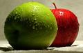
| 10/08/2005 09:37:17 AM |
Natural Complementsby havy2008Comment: Nice textured background and also the foreground base. Good light and shadow especially on the green apple. I would have liked to have seen a bit less wate. Very good idea and well executed. Congrats |
| Photographer found comment helpful. |
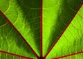
| 10/07/2005 08:34:12 AM |
Beneath the Leafby jonnieComment: The image is reasonably sharp lighting is good but the red lines direct the viewers eyes down to bottom centre and there is nothing to view. I think many people will pass by because of the lack of interest this image creates. Your actual photgraphic skills are good just a bit more work on layout and image selection. Good Luck!! |
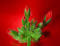
| 10/07/2005 08:27:22 AM |
pelargoniumby KarisMoComment: The shadowed background works very well with the red buds and the buds are nice and sharp with nicely defined petals. Would have really liked to have seen the green leaves and stem much more sharper. The edges are a bit too blurry. ITs a good photo and thes little thing will come with a bit more experimenting. Remember most of the big ribbon winners have been at this for awhile, and are using photo programs like photoshop |
| Photographer found comment helpful. |
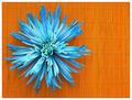
| 10/07/2005 08:11:36 AM |
Blue on Orangeby MsMiaComment: A very nice color combination and the flower is clean and crisp. No blurry's or startling bright light. This would be more appealing if more orange was above the flower rather than beside. The lines direct the viewers eye up and down but all that empty space at the right has nothing else to look at. I think if the right portion was cropped and more was added to the top it would score much higher. Overall you did a good job with the phot just the layout needs a bit of work Congrats and good luck |
| Photographer found comment helpful. |
| 10/06/2005 10:37:19 PM |
Lonesome by danderson107Comment: VEry good. Really like the lighting and texture feel of this. Lighting on background is also very good. '9' |
| Photographer found comment helpful. |
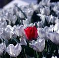
| 10/06/2005 10:35:17 PM |
Out of placeby perrynComment: The foreground flowers have a nice sharp feel and the ones in background are blurred just the right amount,. Would have liked to see the top area with the big white clump cropped out of the image. Overall this is very good and should makle the top ten if not the top 5. Congrats. |
| Photographer found comment helpful. |
Home -
Challenges -
Community -
League -
Photos -
Cameras -
Lenses -
Learn -
Help -
Terms of Use -
Privacy -
Top ^
DPChallenge, and website content and design, Copyright © 2001-2025 Challenging Technologies, LLC.
All digital photo copyrights belong to the photographers and may not be used without permission.
Current Server Time: 08/23/2025 02:40:28 PM EDT.