Red goes Blueby
Harz_JoergComment: Critique Club
Initial thoughts
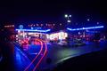
Exposure and colours good � composition poor.
Composition/ Content
In terms of content this image has a number of positive elements � great colour depth with a number of different colour lights captured, a wonderful curve in the car brakelights and some nice lighting on the road surface.
Where I think it is weak is in the composition � the frame feels cluttered and without focus. I�d say the main focal point is the brake light trails as that�s where my eye ends up but the rest of the image is quite distracting. I don�t know where I�m intended to look or what the main subject or intent of the image is.
Cropping the right half out and the left-most dark area to make this a portrait shot strengthens composition for me but may not be what you wanted to show.
I have saved a copy and cropped it in this way incase you�re interested � please do email me and let me know if you are.
Background
I like the richness of the black but find the shapes it makes don�t balance out - the sweeping curve at lower right, a strip across the top and vertical strip to the left feel unbalanced to me.
Camera Work - Technical
Looks great!
Digital Processing - Technical
Can�t see any issues!
Fits The Challenge
Yes � some wonderful blue lights captured very well.
Your Opinion On The Photo
I like some of what�s in this image very much but find the composition itself weak.