| Image |
Comment |
| 04/28/2003 11:44:33 AM |
Mortal Coilby moodvilleComment: Nice collection - a little too much shadow in the lower area of the larger image. Nice composition too. |
 Photographer found comment helpful. Photographer found comment helpful. |
| 04/28/2003 11:43:34 AM |
Two Different Languagesby AnnidaComment: Hi Da!
Can't read the text - it's just too dark on my monitor - well, I can if I get REALLY close to the screen but that's not too practical. I like the two images but the layout doesn't work for me - it doesn't feel balanced or deliberately composed. |
| Photographer found comment helpful. |
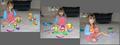
| 04/28/2003 11:42:14 AM |
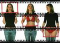
Successby rj324Comment: This is really interesting but I think it would be stronger with three more different poses, all in silhouette. Perhaps from left to right, with arms low, half way up and all the way raised? Or, if the model could manage it, the same pose with different sunset colours behind. I also think it might be stronger with black separators between the three images. |
| Photographer found comment helpful. |
| 04/28/2003 11:40:08 AM |
X-ray frames by kiwinessComment: This is very nicely done indeed. I've enjoyed really looking at this one in depth and think the way you've suggested that the image on the right is actually looking at the central image is very clever. The negative strip background definitely adds interest for me too. I think this is a winner and very commercial - I can see it on a promo postcard advertising underwear. If it's an original idea have you thought about sending it to some companies to suggest the idea for a future campaign? |
| Photographer found comment helpful. |
| 04/28/2003 11:38:01 AM |
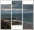
Rolling wavesby agwrightComment: I know I sound like a parrot - and am wary after the recent comments in forum about repetitive comments - but I'm not at all keen on the different heights of images used here. Also, to me this is one photo cut into three - nothing wrong with that at all - it's like looking through a bay window - but I'm personally keener on entries where there are three seperate images used - images that support each other but are different. Just my two pence though! |
| Photographer found comment helpful. |
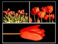
| 04/28/2003 11:35:57 AM |
Triptych Tulipianaby JakComment: I like the images here and the different scales represented but am really not at all keen on the way the lower tulip is on it's side. That feels wrong to me. |
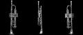
| 04/28/2003 11:35:02 AM |
Trumpetby EJComment: Great images, nice lighting and good clean black background.
Layout doesn't work well for me - I'd prefer much more space above and below the trumpets and much less space between them horizontally. |
| Photographer found comment helpful. |
| 04/28/2003 11:33:52 AM |
|
| 04/28/2003 11:33:00 AM |
Rite of Passageby DougPazComment: Great idea and good colour and light. Choice of background colour just right. I would rather have the left and right images the same height as the central one. The white space behind just makes an odd and unappealing shape for me. |
| Photographer found comment helpful. |
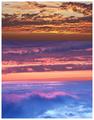
| 04/28/2003 11:31:58 AM |
pacific skiesby lmhrComment: In my opinion this montage would benefit strongly from gaps between the three images - using same colour and width as external border. |
Home -
Challenges -
Community -
League -
Photos -
Cameras -
Lenses -
Learn -
Help -
Terms of Use -
Privacy -
Top ^
DPChallenge, and website content and design, Copyright © 2001-2025 Challenging Technologies, LLC.
All digital photo copyrights belong to the photographers and may not be used without permission.
Current Server Time: 08/24/2025 01:51:39 PM EDT.