| Image |
Comment |
| 06/17/2003 07:58:07 AM |
|
 Photographer found comment helpful. Photographer found comment helpful. |
| 06/17/2003 07:57:00 AM |
|
| Photographer found comment helpful. |
| 06/17/2003 07:56:26 AM |
|
| Photographer found comment helpful. |
| 06/17/2003 07:52:07 AM |
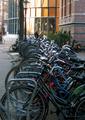
Bicycling Magazineby pedroviegasComment: Bikes are great - background behind them not so great.
Firstly I\\\'d say that waiting till the shot was free of people would help - especially people with their back to camera and leaving the scene.
Would shallower DOF disguise that? Focus on foreground and more blurred in background?
I think you could also do with losing (cropping) some of the top of the shot out. |
| 06/17/2003 07:49:52 AM |
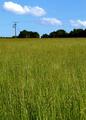
The Ecologistby UberFishComment: I like the simplicity of this. I can't decide whether I'd like it even more if it were even more simple - just grass, sky and clouds and nothing more. I know I'd rather it didn't have the pole and wires but can't decide about the dark trees. More interesting a photo than first glance might suggest. |
| Photographer found comment helpful. |
| 06/17/2003 07:45:52 AM |
"Country Marketplace"by ReneeComment: Great colours and pattern. I would like to see a shallower DOF to throw out the background, which adds nothing to the shot for me. |
| 06/17/2003 07:45:13 AM |
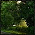
Country Livingby jjbeguinComment: Love that area where dusty light shows through and the way the sun twinkles through the leaves above it.
I think this could be improved by being cropped - taking a little off the left. |
| Photographer found comment helpful. |
| 06/17/2003 07:43:27 AM |
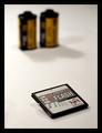
conehead digestby grigrigirlComment: Can't imagine what a magazine of this title might be about but the image is cute and rather enigmatic. |
| Photographer found comment helpful. |
| 06/17/2003 07:42:12 AM |
|
| Photographer found comment helpful. |
| 06/17/2003 07:34:27 AM |
Family Circleby KarenBComment: I love the foreground but not the back. I'd prefer this as a landscape picture cropped from the top to just below where the plate touches the left edge - to make a striking diagonal of black at the top left. That said, I do appreciate that your chosen orientation works better with the magazine in question.
Perhaps more attention on colours/ and surfaces for background objects would make that area as appealing as the front? |
| Photographer found comment helpful. |
Home -
Challenges -
Community -
League -
Photos -
Cameras -
Lenses -
Learn -
Help -
Terms of Use -
Privacy -
Top ^
DPChallenge, and website content and design, Copyright © 2001-2025 Challenging Technologies, LLC.
All digital photo copyrights belong to the photographers and may not be used without permission.
Current Server Time: 08/25/2025 11:40:25 PM EDT.