| Image |
Comment |
| 08/12/2004 11:07:35 AM |
Hand on my heartby KaveyComment: Was chatting to someone about this image today and their comment below about it not being my heart. This was my response, which I thought might be nice to also add here.
It IS the wrong side to be my heart... but it was a figurative title for me so I decided to go with it. "Hand on my heart" is often said to convey truthfulness about the statement it accompanies and that's what I was going for. |
| 08/11/2004 03:53:54 AM |
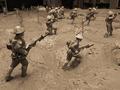
The War to End All Warsby sysop912Comment: I'm flabbergasted that so many people have commented that this does not meet the challenge! The figures are VERY obviously toy soldiers rather than real ones and as such it's simply not necessary to provide an additional element just to give scale - we all know the scale of toy soldiers! |
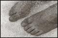
| 08/10/2004 06:04:16 PM |
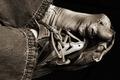
"Poverty is a veil that obscures the face of greatness"by LokiComment: A beautiful image. One would never expect to see an image of feet being used so successfully to convey poverty. The black and white treatment focuses our attention on the textures of the worn and dirty socks and shoes. The jeans don't appear to be correspondingly dirty and worn though, which is a little strange. 8 |
 Photographer found comment helpful. Photographer found comment helpful. |
| 08/10/2004 04:44:08 PM |
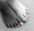
Darling Sister Toesby debitiptonComment: I don't usually like selective desaturation because so many of the examples seem to use it for the sake of using it rather than because it's use really adds something to the shot that wouldn't be achieved with all colour or all black and white. In your shot I really like it's use because, to me, the colour really highlights the message that skin colour isn't important and that people of different races often have more in common than they have not in common. Nicely composed too, simple and unusual. Texture and pattern of floor surface complements rather than distracts. 8 |
| Photographer found comment helpful. |
| 08/10/2004 04:18:50 AM |
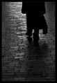
On the Road Againby tyt2000Comment: Such a beautiful and simple image. I particularly like how understated but perfect the light is - low enough to only just bring out the details in the foreground cobbles but enough to make the pedestrian into a solid silhouette. Nicely composed too. 9 |
| Photographer found comment helpful. |
| 08/10/2004 04:17:35 AM |
Miles and Milesby adrenalindreamComment: A lovely idea and the shallow DOF definitely adds something. I am not keen on the ratio being quite so wide and short. I think it would feel more balanced if nearer to a more standard ratio. I understand that would require the text to be positioned a little differently or perhaps just a slightly different composition. Just my two pennies anyway. 9 |
| Photographer found comment helpful. |
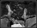
| 08/10/2004 04:15:56 AM |
Huckleberry Had it Right!by elsapoComment: What an evocative image! The reflections in the water really convey a hot sunny day which just calls out for a cooling dip of the feet. Not sure about the decision to go black and white - hard to tell without seeing the same image in colour. Composition works well, you have included just enough of the legs and I like the way they come into the frame from the respective lower corners. 9 |
| Photographer found comment helpful. |
| 08/09/2004 04:58:55 PM |
splash!by AlexysComment: The detail and pattern in the water and reflections is just exquisite. 10 |
| Photographer found comment helpful. |
| 08/09/2004 04:58:15 PM |
Pinnedby moviemanComment: Beautiful, sensuous, well composed, works excellently in toned black and white. 10 |
| Photographer found comment helpful. |
| 08/09/2004 04:55:44 PM |
Feet & Upby jjbeguinComment: Not sure why I like this so much - I think it's because of the unusual composition and the way that an important element of the "story" - the screen hiding the people whose feet we are seeing - is actually providing a block of solid black to balance the shadow in the lower right corner. Composition is just so excellent. 10 |
| Photographer found comment helpful. |
Home -
Challenges -
Community -
League -
Photos -
Cameras -
Lenses -
Learn -
Help -
Terms of Use -
Privacy -
Top ^
DPChallenge, and website content and design, Copyright © 2001-2025 Challenging Technologies, LLC.
All digital photo copyrights belong to the photographers and may not be used without permission.
Current Server Time: 09/01/2025 07:47:38 PM EDT.