|
|
|
Showing 12091 - 12100 of ~12455 |
| Image |
Comment |
| 12/29/2004 12:31:58 PM | Holiday decorations on sale...by nolockComment: ***CRITIQUE CLUB RESPONSE***
There's a considerable charm to this image. The contrast between the pop-eyed santa and the grumpy santa is especially amusing. Nevertheless, nothing in the image elevates it beyond the "snapshot" stage for me, or apparently for the voters. Before addressing this picture individually, I'd comment in passing that your "best" shot might have been to zero in on the 2 santas and play them off against each other for comic effect.
That said, there are a couple things working against this particular image. Most obvious is the extreme yellow cast of the lighting; you almost certainhly used daylight white balance, and tungsten white balance was called for here: daylight is MUCH more blue than tungsten light. (Tungsten light, in case you don't know, is what ordinary lightbulbs throw; also called incandescent light, it is derived by heating a tungsten filament so radically that it glows, and it's VERY warm light) In any case, you can (and should) use any image editing programs color blance controls to neutralize the whites here. Thast would help a lot.
Another problem witht he image is the noticeably skewed "architectural" elements. You fixated on the horizontal molding at top and rotated camera so that was true horizontal, but in so doing you threw the verticals way off, and also further skewed the less-visible horizontal elements at the bottom of the scene. Optimally, the camera would be vertically squarted up for this shot and the the horizontal lines would be true horizontal only in center of image, with upper ones slanting down and across from upper right, and lower ones up and across from lower right.
Or, better yet, you could move the camera POV more to the left so the entire image were more in elevation instead of zooming off to a left-placed vanishing point. This would mean removing the handwritten sighn, but this should have been done anyway ont he image as we see it now, as it's another distracting aspect of the shot.
Finally, it looks to me as if there's a bunch more interesting stuff lopped off at the bottom, and a lot of what's on the top is pretty much wasted image space. I can see why you cropped the way you did, wanting to see the entire loop of the bell-chains (or whatever they are), and I respect that, but it might work better if we had more of the interesting stuff in foreground.
Still, like I say, I think your "shot" might be to focus in on the 2 faces, not go for the overall picture...
Happy New year!
Robt.
|
| 12/29/2004 02:38:18 AM | Peace on ...by GeneralEComment: The moon is precisely in the vertical center of the image right now and the entire left side of the image is just negative blue space. If the moon were out a ways, not too far, and (IMO, but less importantly, up a little) I think there'd be a tad more dynamic flow to this image.
It's hard to explain; it's like, right now, I can't tell from the image itself if the moon was an accident, you know?
Actually, now that I think of it, out and down a tad might work better. Why not do a couple variations in photoshop? Select the moon and some sky with the circle marquee and paste it, use the clone tool to cover the "real" moon with sky on the base layer, then use the arrows to drag the moon layer around to different places and see how it looks. You can scale it up and down too, see what possibilities might have existed with a different lens, etc.
I may be wrong about all this, I often am.
(robt) |
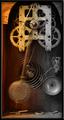
| 12/29/2004 02:30:15 AM | TIME IN MOTIONby DDYJRComment: A nice shot. The hot, over-warm "arch" upper left is unfortunately a real eyetrap here. |  Photographer found comment helpful. Photographer found comment helpful. |
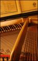
| 12/29/2004 02:28:08 AM | Hammer and Stringsby sbeaumontComment: Very beautiful. Maybe a hair too yellow. I feel like if the large, diagonal bar were angled so it landed a bit further left, this would be better, but that would level the score (not good) or obscure the posts and soem of the red (not good) so.... | | Photographer found comment helpful. |
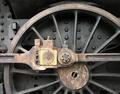
| 12/29/2004 02:26:03 AM | Black Beautyby AlbireoComment: This is exceptionally nice. I'd like to see a slightly more agressive tonal range (a little denser in the dark-but-not-black areas), and I'd have been inclined to 'shop out the light rub-marks above the wheel. | | Photographer found comment helpful. |
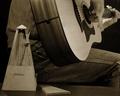
| 12/29/2004 02:23:52 AM | The Pratice Issueby graphicfunkComment: I very much like the play this makes on the concept; not only have we the metronome, which is a purely mechanical device, but we have the idea of the musician practicing the mechanics of his craft. I'd quibble with the cropping left (needs a tad more space) and fore (I don't want to lose the tiny bit of the metronome cover that's missing). | | Photographer found comment helpful. |
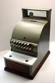
| 12/29/2004 02:21:47 AM | 1920's cash register.by jimsappComment: I love the matter-of-fact serenity of this shot, and the total lack of embellishment on the register. |
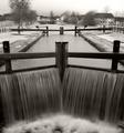
| 12/29/2004 02:20:40 AM | Mechanical lock gates by geewhyComment: This is really, really sweet, the tonalities are so pure, the composition is so locked-in, the flow of the water is so palpable. I appreciate also that this one is outside the box, not just one more of the same thing. There's a LOT of gears, sprokets, and clocks in this challenge... | | Photographer found comment helpful. |
| 12/29/2004 02:18:59 AM | | | Photographer found comment helpful. |
| 12/29/2004 02:18:17 AM | The Perfect Machineby TerramarComment: Very sweet, in the main. I am not 100% sure of using the foot as an example of "mechanical", which I take to be non-organic, but of course the foot is a system of levers. Anyway maybe the shoe's your machine? Whatever... My problem here is I really like the softness of the lighting on foot and step, but can't stand the very unnatural-looiing cutout on the claf, and I think overlaying the border is gimmicky... | | Photographer found comment helpful. |
|
Showing 12091 - 12100 of ~12455 |
Home -
Challenges -
Community -
League -
Photos -
Cameras -
Lenses -
Learn -
Help -
Terms of Use -
Privacy -
Top ^
DPChallenge, and website content and design, Copyright © 2001-2025 Challenging Technologies, LLC.
All digital photo copyrights belong to the photographers and may not be used without permission.
Current Server Time: 09/03/2025 08:33:06 AM EDT.
|