| Image |
Comment |
| 04/27/2005 03:41:56 PM |
Switchby philcozzComment: Very well done. I love the reflection of the hand. |
 Photographer found comment helpful. Photographer found comment helpful. |
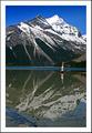
| 04/27/2005 02:53:58 PM |
Hand Stand Manby SalarComment: Your exposure is perfect. The horizon is a little off kilter, though. I'm also left to decide whether the subject is the guy doing the handstand or the stunning mountain in the background. Take out the guy and you have a fantastic landscape. Get rid of the mountain (good luck with that) and you'd have a great minimalism shot. Together they don't work as well as they would separately.
Ok - I've come back to this after a forum message (I'm assuming it's yours -- if not, my apologies). I can see that perhaps the horizon is level and it's just an illusion that makes it look off-kilter. That being said, my opinion is still that this would look better if it appeared level (whether it is truly level or not). The line between the blue of the water and the reflection of the mountain give the sense that the water is going to spill from the photo. Whether that is caused by illusion or by not being level is ultimately irrelevant. This is still a very cool photo, and you are clearly very skilled. You should just be aware that the level illusion is a problem. |
| Photographer found comment helpful. |
| 04/27/2005 02:47:08 PM |
Drinking Glassby dprboyneComment: The "glow" on the right side is a bit distracting. I like flow of the lines, but the dust or scratches (not sure which they are) detract from them. |
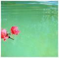
| 04/27/2005 02:33:57 PM |
Adriftby katihComment: Interesting and very zen (not that I'd really know;) I think moving the flowers a little lower in the frame would've improved the feeling of contrast between them and the water/reflections. |
| Photographer found comment helpful. |
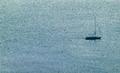
| 04/27/2005 02:32:21 PM |
Navigating the Buoysby milo655321Comment: Very cool. I wish the lighting was a little better so that the buoys and boat didn't get as lost in the noise of the dappled water. |
| Photographer found comment helpful. |
| 04/27/2005 02:31:16 PM |
Houseby umbroComment: Very nice. A little less foreground would give the subject a little more punch and add a bit more drama to the scene. |
| Photographer found comment helpful. |
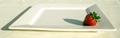
| 04/27/2005 02:30:26 PM |
The Last Oneby guilotalComment: Great concept. I especially like the idea of the frame (of the plate) within the frame (of the photo itself). The orientation of the lighting bothers me a little, though. Given that my eye tends to move from right to left and from bottom to top, the shadow draws me away from the strawberry instead of towards it. I think this might have been a little better if the strawberry were in the upper left and the light source was also from the upper left. This would have caused the shadow to draw my eye from the center of the photo to the strawberry, moving from right to left and bottom to top. |
| Photographer found comment helpful. |
| 04/27/2005 02:27:12 PM |
Ole Yellerby vtruanComment: I'm not sure if this meets the minimalism challenge. As far as the composition goes, I really like the lines of the birds body and how they take the viewer's eye right to the bird's eye. The only change I would make would be to include all of the bird's tail. |
| Photographer found comment helpful. |
| 04/27/2005 02:25:23 PM |
One last ride?by LevTComment: Very nice composition. The colors seem a bit off to me, though. A "cooler" palette might have set a better mood. |
| Photographer found comment helpful. |
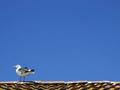
| 04/27/2005 02:23:10 PM |
seagull on the roofby photomikeComment: Nice. I like the way you positioned the gull in such a way as to make us wonder what it's looking at. |
Home -
Challenges -
Community -
League -
Photos -
Cameras -
Lenses -
Learn -
Help -
Terms of Use -
Privacy -
Top ^
DPChallenge, and website content and design, Copyright © 2001-2025 Challenging Technologies, LLC.
All digital photo copyrights belong to the photographers and may not be used without permission.
Current Server Time: 08/23/2025 11:40:24 PM EDT.