| Image |
Comment |
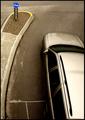
| 04/27/2005 08:20:42 PM |
This Wayby SiRaComment: Very creative. Looks like a selective desat., but that could just be the natural colors. Either way, I think it really helps isolate your subject. The form of the car may be a little too strong for the purposes of the challenge, but I think it creates a great balance with the sign. |
 Photographer found comment helpful. Photographer found comment helpful. |
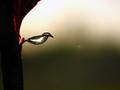
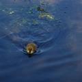
| 04/27/2005 08:18:39 PM |
Water Birdby John SniderComment: Very cool shot. I like this a lot. Only distraction are the spots near the middle of the frame. |
| Photographer found comment helpful. |
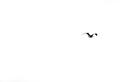
| 04/27/2005 08:16:37 PM |
fly awayby suemackComment: Great composition. The bird is a little blurry (focus or motion blur - not sure), but I actually think that it adds to the mood. |
| Photographer found comment helpful. |
| 04/27/2005 08:15:02 PM |
Unknown Soldierby cosmicComment: This is a good idea, but the white background is a little too much for me. I think you could have still met the challenge and improved the shot by using the board as the entire background. |
| Photographer found comment helpful. |
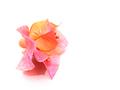
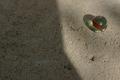
| 04/27/2005 08:13:14 PM |
just a little bitby FyzarlComment: Beautiful colors. The placement doesn't quite work for me, though. There's not enough empty space to create a real sense of tension or drama. |
| Photographer found comment helpful. |
| 04/27/2005 08:11:47 PM |
Crystal, stone and lightby rbennyComment: An interesting idea. I'm guessing that the placement of the shadow was intentional, but I'm not sure what the intent was. The transition from light to dark in the middle of the frame just seems distracting to me. |
| Photographer found comment helpful. |
| 04/27/2005 08:09:59 PM |
Little duckby TedvandenBerghComment: Hey, that's not a _rubber_ duck! Well captured, everything looks nice and sharp. The composition might be improved by isolating the duckling more, getting it away from some of the weeds and perhaps using a more extreme placement in the frame. |
| Photographer found comment helpful. |
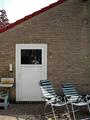
| 04/27/2005 08:08:05 PM |
Zoom in on the windowby maessengerComment: Interesting concept, but it feels a little muddled to me. You've definitely met the letter of the challenge, but I think the subject should stand out a bit more from it's background (or in this case, foreground). |
| Photographer found comment helpful. |
| 04/27/2005 08:06:33 PM |
|
| Photographer found comment helpful. |
| 04/27/2005 08:05:54 PM |
Greenpointby paha_lComment: A nice, artistic approach to the challenge. Still, my tastes prefer something to be in focus, but hey, that's just me. |
Home -
Challenges -
Community -
League -
Photos -
Cameras -
Lenses -
Learn -
Help -
Terms of Use -
Privacy -
Top ^
DPChallenge, and website content and design, Copyright © 2001-2025 Challenging Technologies, LLC.
All digital photo copyrights belong to the photographers and may not be used without permission.
Current Server Time: 08/24/2025 09:46:37 AM EDT.