| Image |
Comment |
| 08/15/2002 11:47:00 AM |
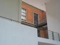
Extensionby zacowacoComment: very cool compostion. i love all the geometric lines and shapes going on. if you could pull some of the cyan or blue out of the walls and bring to a more pure white and then saturate those red bricks this could have much more impact. good eye. keep it up. |
| 08/12/2002 04:49:00 PM |
Hopes and Dreamsby NitenComment: the card seems to be more in focus than the rings. maybe that was your intent but i think maybe the rings should be the focal point especially in this compositon |
 Photographer found comment helpful. Photographer found comment helpful. |
| 08/15/2002 11:42:00 AM |
|
| 08/12/2002 04:54:00 PM |
|
| 08/15/2002 11:50:00 AM |
|
| 08/15/2002 11:37:00 AM |
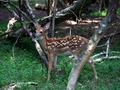
fawnby KrazyKatComment: nice color and good detail. the branch in the foreground bothers me a bit. i know how hard it is though to catch the right moment when photographing wildlife. nice job. |
| 08/15/2002 05:32:00 PM |
Grand Beginnings!by shedevilComment: ring looks somewhat distorted, like the image was stretched. the color is wierd too. looks kind of like a dark image lightened too much with levels. nice idea. |
| 08/15/2002 11:45:00 AM |
|
| 08/15/2002 11:39:00 AM |
|
| 08/15/2002 12:44:00 PM |
|
Home -
Challenges -
Community -
League -
Photos -
Cameras -
Lenses -
Learn -
Help -
Terms of Use -
Privacy -
Top ^
DPChallenge, and website content and design, Copyright © 2001-2025 Challenging Technologies, LLC.
All digital photo copyrights belong to the photographers and may not be used without permission.
Current Server Time: 07/21/2025 05:45:30 AM EDT.