| Image |
Comment |
| 10/24/2005 10:08:51 PM |
Contemplationby NunoComment: Congratulations, Nuno. I am delighted to see your name on the ribbon page ... I have admired your stuff ever since your Long Exposure image, which was cruelly under-estimated by the voters. This one is very beautiful and also a little more DPC-friendly! I did not vote, or even look at the entries until now, but this image would have been in my top two choices. Bravo! |
 Photographer found comment helpful. Photographer found comment helpful. |
| 10/18/2005 06:58:22 PM |
Fall in a medieval townby puzzledComment: I like it ... and you KNOW how I like pictures of churches! I thought it was a touch oversaturated at first glance, then I realised that's what the colours really were (except for a bit of intensifying via the polarizing filter). Moving closer might accentuate the 'lean' of the building even more, but I'd have done it anyway & so got rid of the fence. I feel the horizontal line of the fence is a little graceless, and is fighting with the beautiful verticals of the church. Also, it looks like there are some gravestones hidden behind that fence, and they'd add a lot more atmosphere to the image than the fence does. Adjusting verticals in PS is not too hard, as long as you remember to just reduce the 'lean', and not eradicate it altogether (which looks unnatural & makes the building appear squat). For truly expert advice on correcting perspective in architectural subjects, send a PM to bear_music. Cheers! P. |
| Photographer found comment helpful. |
| 10/17/2005 12:36:46 AM |
Shock of the Newby ImagineerComment: Congratulations! Now that's a ribbon to REALLY celebrate. Message edited by author 2005-10-17 00:37:06. |
| Photographer found comment helpful. |
| 10/16/2005 11:34:49 PM |
The Power of Life by roadrunnerComment: OK, I happen to know who took this, and so I was intending to abstain from voting on it. However, because it is the most interesting and allegorically ambitious image in this challenge, I've decided that abstinence would be churlish. It's a brilliant photograph, even among the best on DPC. The figure seems to me to be jubilantly conducting a titanic natural orchestra (Neptune's Philharmonic plays Wagner?) ... a fabulous celebratory concept! The composition and the deliberately Stygian processing are just right for this subject and theme, although some sad souls will inevitably say it's 'too centred' and 'too dark'. Anyone with sub-standard greyscale monitor calibration may also call it 'too dark'.
And so, because I'd certainly give it a 10 if I didn't know who took it, I'm giving it one now. |
| Photographer found comment helpful. |
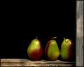
| 10/12/2005 12:30:23 AM |
pearsby dragonladyComment: Elegant solution to the challenge and a really wonderful composition. Didn't vote (maybe because I'm colourblind!), but I would have given this 10, I promise. |
| Photographer found comment helpful. |
| 10/12/2005 12:19:06 AM |
Breakfast at Clarke'sby Keith ManiacComment: Congratulations, Chris. What I like best (other than Kapan) is the crop ... there's something very intimate & 'coffeshop-esque' about the fact that both the model and the cup are cropped a bit. It makes them sort of squeezed in, as happens in most coffee shops. Can't believe people wanted the cup in focus; perhaps they thought it was an accident, or that you don't know how to work your camera?
(edit for spelling) Message edited by author 2005-10-12 00:20:23. |
| Photographer found comment helpful. |
| 10/11/2005 06:11:49 PM |
Rainy Daisy Days by CNovackComment: A classic DPC-style image. Well conceived and cleverly executed ... artistically unprepossessing perhaps, but certainly technically competent. I wonder what Rainy Daisy Days are? It will score very highly of course. 6. |
| Photographer found comment helpful. |
| 10/11/2005 06:06:53 PM |
Ton up at Lordsby tonyvComment: I suppose many here will wonder what a 'ton' is, and where 'Lords' is. It's a very effective (if staged) image, and a gesture of celebration warmly familiar to all lovers of the game. He does, however, look surprisingly young to have made a century there. I very much like the nearly-but-not-quite silhouette effect, especially with the highlights on the back of the bat. Well played! 8 |
| Photographer found comment helpful. |
| 10/11/2005 09:42:17 AM |
|
| Photographer found comment helpful. |
| 10/11/2005 09:40:58 AM |
Magical Morning Mist by jemisonComment: A lovely, evocative scene, and a worthy celebration event. I especially like the fact that the beautiful mist produces a graduated contrast in the balloons, from ethereal at the bottom to sharply defined at the top. 7 |
| Photographer found comment helpful. |
Home -
Challenges -
Community -
League -
Photos -
Cameras -
Lenses -
Learn -
Help -
Terms of Use -
Privacy -
Top ^
DPChallenge, and website content and design, Copyright © 2001-2025 Challenging Technologies, LLC.
All digital photo copyrights belong to the photographers and may not be used without permission.
Current Server Time: 08/15/2025 05:32:14 AM EDT.