| Image |
Comment |
| 04/28/2005 10:02:17 AM |
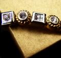
From the Gold Boxby loveComment: Nice use of color. The focus is soft, but it appears to be intentional. Gives the jewelry a happy worn look which is a different approach from the bright, sharp jewelry images in other entries. There are some dark shadows, but it comes off just fine. Good job overall. Best of luck in the challenge. |
 Photographer found comment helpful. Photographer found comment helpful. |
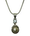
| 04/28/2005 10:02:15 AM |
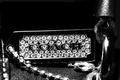
Girls' Best Friendsby koltrane75Comment: Why not color? The impact of diamonds is lost in the B/W. Nice sparkle from the necklace but from the title I get the impression you wanted this image to be about the diamonds... |
| Photographer found comment helpful. |
| 04/28/2005 10:02:12 AM |
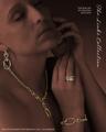
The Links Collectionby EddyGComment: Nice job duplicating the feel of a Jewelry Advertisement. Good pop with the jewelry pieces...they stand out nicely. Nice use of lighting to get this effect. I'm thinking this will make top 10. Good luck. |
| Photographer found comment helpful. |
| 04/28/2005 10:02:09 AM |
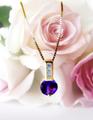
Speak Her Language!by SunnieeComment: Very nice use of the roses. The colors in this jump out nicely. The only nitpicks I can come up with are the necklace is a little hot in the mid-section, and the green in the top left corner is a little distracting. Overall, great job. Good luck. |
| Photographer found comment helpful. |
| 04/28/2005 10:02:02 AM |
|
| Photographer found comment helpful. |
| 04/28/2005 10:01:59 AM |
My Wife's Favorite Necklaceby rlinn3Comment: It's ok. Seems a bit washed out, perhaps because of the white background. The diamond is well lit, but lacks sparkle. How did this look with a black background? |
| Photographer found comment helpful. |
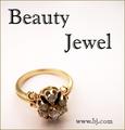
| 04/28/2005 10:01:54 AM |
Beauty Jewel...by sfarrell23Comment: Pretty decent image of the ring. The face of the ring where the jewels (and emphasis is) is a bit dark. Good DOF. The text used looks like it was upsized and looks jagged around the edges. Best of luck in the challenge. |
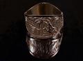
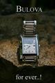
| 04/28/2005 10:01:47 AM |
Bulova for ever..!by joaquinComment: Cool props - I like the rock. Lighting is ok. Focus on the watch seems off a bit. What is that reflection on the left side of the watch? Looks like sunglasses. ;^) Good luck. |
| Photographer found comment helpful. |
| 04/28/2005 10:01:40 AM |
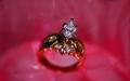
Today, Tomorrow, Forever....by TruegshtComment: Hmmm...sure is a lot of red in there. For me it's not appealing (the color that is), but that's JMO. The ring itself came out very nice. Good full color in the stones with nice lighting. Perhaps just a bit too shallow on the DOF - the leading edge of the ring under the front three stones should be in focus. Again, JMO. ;^) Good luck in the challenge. |
| Photographer found comment helpful. |
| 04/28/2005 10:01:36 AM |
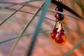
Amber Sunsetby ZoomdakComment: Hey - They're water droplets! Cool idea. ;^) Nice job on the composition. Looks like natural lighting was used - smart idea. I like it. You may take a hit for not attempting to incorporate some text, but hey - it should still do ok. Good luck. |
| Photographer found comment helpful. |
Home -
Challenges -
Community -
League -
Photos -
Cameras -
Lenses -
Learn -
Help -
Terms of Use -
Privacy -
Top ^
DPChallenge, and website content and design, Copyright © 2001-2025 Challenging Technologies, LLC.
All digital photo copyrights belong to the photographers and may not be used without permission.
Current Server Time: 08/09/2025 08:02:25 PM EDT.