| Image |
Comment |
| 02/09/2003 04:41:50 PM |
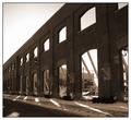
Schaumburg Clock Towerby pitsamanComment: A visit from the critique club :)
This photo does not really do much for me. Sure, it meets the challenge but it does not engage me. The focus is a bit off. The image looks soft. There's also noise in the sky.
The exposure is pretty good. I would like to have seen several different angles on this. |
 Photographer found comment helpful. Photographer found comment helpful. |
| 02/09/2003 04:23:15 PM |
Once Upon A Timeby mariomelComment: A visit from the Critique Club :)
Oooh, I love this photo! I particularly like the sun spots from the sun going through the doors and the windows. The symmetry & repeating patterns are top notch. Well executed with great focus, depth of field and exposure. The only minor suggestion I have is cropping the rightmost window/door off it was split in half and I'd probably like to crop it off. My opinion of course :) |
| Photographer found comment helpful. |
| 02/09/2003 04:20:41 PM |
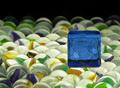
Riding on a Sea of Marblesby smellyfish1002Comment: A visit from the Critique Club :)
Interesting photo indeed. I like these types of photos where you have many similar/identical objects with one or several that are "misplaced".
Interesting composition but there are 2 things that bug me a little bit. The marbles do not fill up the whole frame, it seems that this photo would work better if the marbles filled up everything in the background. Even if you ran out of marbles angling the camera would have been sufficient. The other thing that I don't particularly like is the way that blue square is just "floating" above the marbles.
Having said that, I like the idea, I like the colors and the focus is good. I also like how you blurred the background with good use of the aperture. |
| Photographer found comment helpful. |
| 02/09/2003 04:02:24 PM |
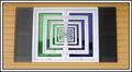
Window to Infinityby JackoComment: A visit from the critique club :)
First, I was going to ask about the editing but then I remembered that this is a free challenge.
I like it, it's definitely something I would have liked to try for a windows/doors challenge. The first thing that jumps at me is the odd distortion on the lines. Looks like you didn't get this photo straight on.
I definitely love the colors. They are perfectly balanced. Not too bright, not too dark, complimentary to each other. I would perhaps try to crop off the orange just for kicks to see what kind of an image you get from that. |
| Photographer found comment helpful. |
| 02/08/2003 11:36:37 PM |
Gvmt Building - Bunch of squares...by kosmikkreeperComment: A visit from the critique club :)
I like the title, it's funny but I usually do not rely on the title.
At first glance, I'd say this photo does not have enough substance. It also does not help that the windows are not square. At least the section you chose does not appear squared. The windows on the right section look to be more square. The reflections on the left side are a tiny bit distracting, I'd try to compose so that they do not exist and emphasis is on the right windows.
Not sure what else to add to this, it's a very "simple" image in terms of substance.
|
| Photographer found comment helpful. |
| 02/04/2003 03:49:06 PM |
|
| 02/04/2003 03:47:53 PM |
Maddy in classic pearlsby LindaLeeComment: ROFL! OMG This is the funniest photo I've seen in a while. Must have a very cooperative dog. The only complaint is that toe focus is a bit soft. But the dog has the perfect expression. |
| Photographer found comment helpful. |
| 02/03/2003 12:23:29 AM |
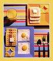
"OCB: Obsessive Compulsive Breakfast" by KickDrum5150Comment: Hahaha, I had the right idea, but the execution on mine was much worse than yours. Congrats.
Easy way to get square eggs is to microwave them in something square for a little bit...Then finish them by frying. If you try microwaving them they kind of explode ;( |
| 02/02/2003 12:39:09 AM |
Will you be next?by Delta_6Comment: A visit from the critique club :)
After looking at the photo for a while there's a lot of little oddities that come to mind. First, the technical aspect of the photo. Composition is good but the sign is a little "too close" to the edge. I think you could shift the sign a tiny bit over to the right. The other thing I notice is the jaggies in the diagonal lines. Perhaps you oversharpened the photo a bit.
Now for the artistic quality. I think this photo has some bittersweet irony in it. The road looks desolate but people have been killed :(
The other thing I don't understand is the three crosses vs. 2 fatalities. Do all the roads have one of these signs?
And no, I hope I'm not next! |
| Photographer found comment helpful. |
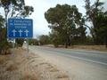
| 02/02/2003 12:19:26 AM |
Directions To My Houseby bamasterComment: A visit from the Critique Club :)
Interesting, I like the composition, it's not dead center, it has appealing lines which provide both contradiction and symmetry to me.
The colors are plain and simple. I feel I could definitely see this photo in the paper for some kind of an article, but, it needs the story.
I feel that this photo is missing a link to a good story. It's simple, abstract but does not have a story behind it. For example, the title you gave it links to the image but even there, we could do choose a different more suitable title like "Stock Market in a slump, dead end for investors?" or something similar.
I think technical quality is superb, but artistic value is only mediocre. |
Home -
Challenges -
Community -
League -
Photos -
Cameras -
Lenses -
Learn -
Help -
Terms of Use -
Privacy -
Top ^
DPChallenge, and website content and design, Copyright © 2001-2025 Challenging Technologies, LLC.
All digital photo copyrights belong to the photographers and may not be used without permission.
Current Server Time: 08/04/2025 11:58:44 AM EDT.