| Image |
Comment |
| 02/16/2003 05:24:12 PM |
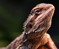
My Exotic Petby CreativeFlyPhotoComment: Hey there :) !
A visit from the critique club :-)
I think the photo is very worthy of the score. There is quite a lot of detail in this photo, the exposure is perfect, focus is great and you have an excellent subject here.
The only thing I could possibly want is a bit more depth of field but I think it's is excellent as it is. And it even looks like she has a smile on her face :) |
 Photographer found comment helpful. Photographer found comment helpful. |
| 02/16/2003 05:09:12 PM |
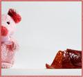
OK, I'm Smilingby MustbelostComment: A visit from the critique club :)
A couple of things I noticed after looking at the photo.
1. There is some overexposure in the white fur, particularly on the back.
2. The ears are cut off a bit
3. He really is smiling :)
I think #1 could be fixed with some light diffusion, or, a faster shutter speed, or more even light. #2 is to recompose a bit better, I like the way it is with the exception of the dog ears.
Overall a good photo but needs some tweaking. And it definitely meets the challenge. |
| Photographer found comment helpful. |
| 02/16/2003 03:41:32 PM |
Need Milk!!!!!by nathaliedooComment: A visit from the Critique Club :)
Definitely a cliché photo. I think it works very well and you did quite a good job with this.
The biggest complaint I have is of course the overexposed areas on the right side of the face and the white of the bottle. I'm not sure if you intended to do it like this but I think slightly less on the overexposure would have made it a better overall photo.
I love the expression on the kids face. It's so adorable. The focus is perfect. A lot of detail in the face in particular.
I like the B&W on this, kind of gives it a very "old" feel. |
| Photographer found comment helpful. |
| 02/16/2003 01:57:49 PM |
Camelliaby Geo_GriffinComment: A visit from the critique club :)
Overall, I think you did good but that shutter speed killed your photo! Trying to get a good depth of field made your shutter only 1/10th of a second which is a very difficult shutter speed to hand hold, you should have definitely used a tripod.
The lighting is good, depth of field is good but focus could use a little of an improvement. It's definitely blurred by camera shake.
Definitely a cliche photo as well. Composition is quite good, I agree with Harz_Joerg that trying to go for the rule of 3rds would be pointless here, I like the way you have composed the photo, not straight on but a bit off to the right. |
| Photographer found comment helpful. |
| 02/16/2003 01:53:37 PM |
Cowboy Photographerby sherComment: A visit from the critique club :)
Congrats on your first entry, but don't get discouraged. It takes a while to get used to the way people vote and critique around here.
I agree with some of the comments about the background being a bit too busy. I think getting rid of that flower and cart would have been better.
Good exposure and focus. You did pretty good for your first time. |
| Photographer found comment helpful. |
| 02/16/2003 01:47:06 PM |
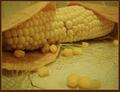
Cereal Killers (Cannibal Corn)by GeneralEComment: A visit from the critique club ;)
Heh, at first I couldn't figure it out, I had to see the challenge to clue me in on the subject matter & the title.
First impressions are that the overall image is too busy. And it has a yellowish tint particularly in the foreground where the cloth(?) looks like it should be white.
Reading your comments I did arrive at that conclusion that the tortillas were trying to eat the corn. But, I think you downplayed the tortillas role in this scene. Only after careful examination can I see that they are indeed tortillas and that they are trying to eat the corn. Perhaps filling a tortilla with corn kernels and placing it in the foreground with kernels falling out would give it more "artistic punch".
Another thing that sort of bugs me is are the kernels in the foreground. They are a bit blurry and I can see that you used only f/2.8 instead of something higher like f/8. That grass to the left tends to be the primary focal point and I think it would be better without it.
It definitely meets the challenge and I love the clever idea. I think you have something really good going here but a few more tries at it would give you a much stronger image. |
| Photographer found comment helpful. |
| 02/16/2003 01:39:10 PM |
Before ..................... and .................. Afterby dimitriiComment: A visit from the critique club :)
At a first glance I was confused as to what that was on the right. It took me some thinking to figure out what that was. The framing is definitely interesting. What I would have used instead of that meat product is just some fried up bacon or some hot dogs. It would definitely be a much easier thing to recongnize.
The depth of field is fine, exposure is good with the exception of that reflection on the meat. It doesn't hurt a lot but since my eye did spend most of the time looking at it I think better diffusion of light would have added a little to it.
Meets the challenge of course. |
| 02/16/2003 01:35:18 PM |
Just another Roseby jab119Comment: A visit from the critique club :)
Overall I like this photo. It's nothing super special but I think it's pretty good.
Things I particularly like: The depth of field is perfect, the background is blurred but everything you intended to be in focus is. Focus is good. Could use a pass in the unsharp mask to make it a notch sharper. The drops of water add a nice touch to the flower. The shadows give it good depth. I think my only complaint is the lack of light. It looks a tiny bit dark. I think a slightly longer exposure would make this a much stronger image. (Assuming you don't eliminate the shadows of course).
Overall a good image and it definitely meets the challenge. |
| 02/09/2003 11:24:18 PM |
A Negative Influenceby GekkerComment: A visit from the critique club :)
Interesting effect! It looks almost like Infrared. Composition overall is pretty good. But I don't know if the effect you chose for this image was more beneficial than a regular photo. There is a lot of detail that is brought out by the effect, particularly in the trees in the upper right corner. I think it draws the eye away from the central subject here.
Focus is pretty good but I really can't comment on much else here. |
| Photographer found comment helpful. |
| 02/09/2003 06:56:31 PM |
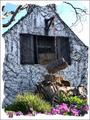
Cottageby GotchaComment: A visit from the critique club :)
I think this image was good, but you actually took away from it with the photoshop work. The foreground is a bit busy but I like the old wagon/cart thing leaning against the wall. The foreground flowers I could care less about. They don't add much to the image.
The white uneven photo does not help the photo, I think you should have made it a solid white black border or something dark single colored so that the white house and the sky stand out.
I think this would work really well with B&W or Sepia tone perhaps some dust and some other photoshop work to make it look "old" and it would be much better.
It definitely meets the challenge, composition is good (aside from the forground flowers), focus is great and exposure is dead on. Good try but could be a bit better. |
Home -
Challenges -
Community -
League -
Photos -
Cameras -
Lenses -
Learn -
Help -
Terms of Use -
Privacy -
Top ^
DPChallenge, and website content and design, Copyright © 2001-2025 Challenging Technologies, LLC.
All digital photo copyrights belong to the photographers and may not be used without permission.
Current Server Time: 08/05/2025 03:35:46 AM EDT.