| Image |
Comment |
| 01/15/2007 02:33:57 PM |
Battle Wonby KenComment: great concept, interesting angle, good use of select desat.
Grey tone however leaves this image somewhat flat.
( 5 ) |
 Photographer found comment helpful. Photographer found comment helpful. |
| 01/15/2007 02:32:27 PM |
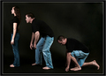
Size Isn't Everythingby riotComment: Too much space between the players. Oversharpening left his nose looking like a set of stairs. Too much shadow, not enough back light on the top, coming down.
Otherwise, great focus, good concept.
( 5 ) |
| Photographer found comment helpful. |
| 01/15/2007 02:30:01 PM |
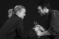
Evolution Revolution by idnicComment: Great concept, murky shadows and lack of back lighting on left leave the image flat. It directly takes away from the punch line. She should have more space in front of her and be well-defined against the background.
( 5 ) |
| Photographer found comment helpful. |
| 01/15/2007 02:27:25 PM |
Women & Mapsby lahulfmanComment: This one challenges me. It feels off center/titled, but the motion blur and gold tone may be an illusion in the making. Nice expressions and framing.
( 5 ) |
| Photographer found comment helpful. |
| 01/15/2007 02:26:15 PM |
SOAP vs SPORTSby InDotsComment: Image concept fair. Stark image, the negative space with the white rope detracts from the impact. Otherwise a great clean image, focus spot on, nice tonality.
( 6 ) |
| Photographer found comment helpful. |
| 01/15/2007 02:24:23 PM |
Toolsby admart01Comment: Torn on this one. The image quality is great and concept better than many, however the coloration of tools vie for attention and make the whole seem more grey than it probably should.
Benefit of doubt, ( 6 ) |
| Photographer found comment helpful. |
| 01/15/2007 02:24:13 PM |
Mine!!by indridistefansComment: Great concept, expression, lighting.
Crop seems too wide some loss of impact there.
( 7 ) |
| Photographer found comment helpful. |
| 01/15/2007 02:23:31 PM |
... PANTS - someone's gotta wear 'em! ...by rozComment: I wish the light here was more dynamic, otherwise a great image, but hard to translate to challenge without title. I love the angle/pov and DOF here. Great job.
( 6 ) |
| Photographer found comment helpful. |
| 01/15/2007 02:19:35 PM |
|
| Photographer found comment helpful. |
| 01/15/2007 02:18:19 PM |
|
| Photographer found comment helpful. |
Home -
Challenges -
Community -
League -
Photos -
Cameras -
Lenses -
Learn -
Help -
Terms of Use -
Privacy -
Top ^
DPChallenge, and website content and design, Copyright © 2001-2025 Challenging Technologies, LLC.
All digital photo copyrights belong to the photographers and may not be used without permission.
Current Server Time: 08/23/2025 05:33:17 AM EDT.