| Image |
Comment |
| 04/15/2003 07:35:18 AM |
|
 Photographer found comment helpful. Photographer found comment helpful. |
| 04/15/2003 07:34:12 AM |
|
| 04/15/2003 07:33:06 AM |
|
| Photographer found comment helpful. |
| 04/15/2003 07:30:07 AM |
|
| Photographer found comment helpful. |
| 04/15/2003 07:28:58 AM |
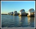
Weather Protectionby Geo_GriffinComment: Excellent colour, light and focus. Good choice of subject too with good framing. Only criticism - seems lightly off-level. 9 - floyd |
| Photographer found comment helpful. |
| 04/15/2003 07:27:19 AM |
|
| Photographer found comment helpful. |
| 04/15/2003 07:25:49 AM |
|
| Photographer found comment helpful. |
| 04/15/2003 07:25:19 AM |
|
| Photographer found comment helpful. |
| 04/15/2003 07:24:24 AM |
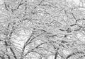
After the stormby vcosmaComment: Very moody and intense. Seems a little off-level though. Could also have used a focal point or some framing. 7- floyd |
| Photographer found comment helpful. |
| 04/15/2003 07:21:35 AM |
Scent of Childhoodby shareinncComment: Greetings from the Critique Club
My first impression of your picture relates to the title - which is unusual for me. The very close view of the crayons and the suggestion of scent in the title does remind me strongly of what it's like to play with crayons so well done for evoking a mood and a childhood memory. That certainly adds a measure of charm to this picture for me.
The second thing that stikes me about this shot is that the colours of the crayons dont seem vibrant enough. In fact they almost seem deliberately desaturated. I can't tell if this was intentional but I'm guessing it wasn't. I think during post processing it would have been worth playing around a little with the levels and colour saturation to really make those colours pop off the screen.
Your focus is excellent here and I also like your lighting which nicely shows the shapes of the crayons with just a couple of highlights. The framing is interesting and I quite like it but I suspect quite a few people wondered why there was such a large black space in your shot. Personally I like the balance it gives the picture between colour and black - like light and dark. You've already had comments about the aparrent scratch in the bottom right which is a little distracting.
Overall I'd say you had a very clear idea in mind about what picture you wanted to take and you've been very successful in getting it. Aside from a little post processing and perhaps a tiny bit more setup (maybe roll the crayons so the labels all look the same) I'd say you did everything right. Well done. Deserving of a higher score than what it got in my opinion. |
Home -
Challenges -
Community -
League -
Photos -
Cameras -
Lenses -
Learn -
Help -
Terms of Use -
Privacy -
Top ^
DPChallenge, and website content and design, Copyright © 2001-2025 Challenging Technologies, LLC.
All digital photo copyrights belong to the photographers and may not be used without permission.
Current Server Time: 08/28/2025 04:57:43 AM EDT.