| Image |
Comment |
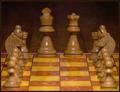
| 11/24/2004 12:36:17 PM |
Authority in Chessby setechaComment: Nice idea. You might have put the figures closest at hand a bit more to the side. And adding some more (yes, you'd need another set of figures) would have made the idea of a corridor leading to the king&queen even stronger. Nice idea though, how two figures can dominate a whole game. |
 Photographer found comment helpful. Photographer found comment helpful. |
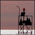
| 11/24/2004 12:34:23 PM |
port authorityby byoungComment: This one would have worked better if there was a guard standing there. You know, like in Baywatch. The crop works fine for me. Perhaps some more saturation. |
| Photographer found comment helpful. |
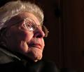
| 11/24/2004 12:32:55 PM |
Matriarchby BibliophileComment: By chosing to capture her from below you wanted to show her dominant position. That's good. I think if the light came from below, too, that would have emphasized this impression. |
| Photographer found comment helpful. |
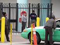
| 11/24/2004 12:31:27 PM |
The Crossingby rkligmanComment: This picture shows but the persons' backs. You might have tried catching some more faces. This is where people have to pay taxes, right? How about making them tax a camera? |
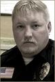
| 11/24/2004 12:29:31 PM |
Young Chiefby undieyatchComment: I'd not have cropped the top of his head and the left of the flag. The picture might use some more colour, too.
You might have made the officer show his mark, kinda like in the movies. "LAPD Ma'am, we need to have a look into your trunk." |
| 11/24/2004 12:27:02 PM |
What would my authority say to one more beer for me?by ArnarpComment: Yeah, this is funny. I guess that's your wife in the background? I like how you made her look as if she was your bad conscience. However the long exposure caused some heavy blur on you/your male model. The scenery isn't too interesting I must admit. There are too many details in the background which take the eye's attraction from the main subject. A pub would have been nicer as location. And that torchlight on the right hasn't got anything to do in there. It doesn't add to the picture. |
| Photographer found comment helpful. |
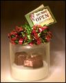
| 11/24/2004 09:49:27 AM |
Unauthorized Entryby fulgentComment: This is a nice way to present authority and how to bypass it.
The shadows would have been better if they were behind the plastic, thus invisible. |
| Photographer found comment helpful. |
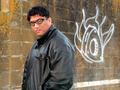
| 11/24/2004 09:43:23 AM |
The authority on Graffitti as an art formby kiwinickComment: Huh? Sorry, but what does that title mean? And, except for the word authority in the title, I can't see what this picture has to do with it.
I'd have put that guy either on the right side of the graffiti or made him turn around. He's facing the left side of the picture, the graffitti is in his back. The eye is led away from it! |
| Photographer found comment helpful. |
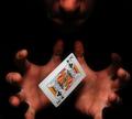
| 11/24/2004 09:39:00 AM |
Psychic authorityby theodor38Comment: Nice shadows. I wonder what this picture would look like if all of the hands were on it, and without the nose. |
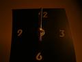
| 11/24/2004 09:37:24 AM |
The Ruler Of Allby DmaskezeComment: Lighting and contrast! The single parts of the clock blend too much with the background. |
Home -
Challenges -
Community -
League -
Photos -
Cameras -
Lenses -
Learn -
Help -
Terms of Use -
Privacy -
Top ^
DPChallenge, and website content and design, Copyright © 2001-2025 Challenging Technologies, LLC.
All digital photo copyrights belong to the photographers and may not be used without permission.
Current Server Time: 09/04/2025 08:48:30 PM EDT.