| Image |
Comment |
| 09/20/2002 09:24:00 AM |
Cowspaceby RemieComment: I'm changing my vote on this one. First I gave it a 5. Seemed like waay to much space, and not my art school definition of negative space. But the image has stuck with me. Last night I woke up in the middle of the night and thought "I know what it is". Where I live, there iss NEVER that much space. It all gets filled in with trees and bushes and telehone poles and such. The whole point of the picture IS the space, and the cows are the secondary part. Great picture! sorry I'm just so slow. Must be why people on the coasts are attracted to the sea, it's the only place that isn't cluttered with nature. 9 |
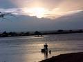
| 09/16/2002 03:51:00 PM |
THE GIFTby alexComment: This is a pet peeve of mine - straighten the horizon, especially on water, gravity does. |
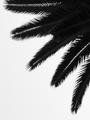
| 09/17/2002 09:36:00 AM |
Nature's Head Dressby autoolComment: I think this is the BEST use of negative space of the lot of them. There is a balance betwen neg and pos, if you remove the subject, the spaces are interesting in ther own right. Nice composition, too. Overall a bit boring, not a picture I'd want to look at over and over. 8 |
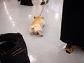
| 09/16/2002 04:58:00 PM |
gone barefootinby queen 91Comment: I think I would have liked it better with the shoes on top, as if he had stepped forwards out of them. Then the expanse of grass would make more sense. |
| 09/16/2002 05:59:00 PM |
shopperby grahamgormanComment: Wow, this is great. Wonderful colors, blue sky, blue dots, mirror image lights, funny lady with baby carraige, Wow, the yellows, Wow - This has to get a ten. 10 for meeting the challange and 10 for being a great photo. |
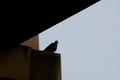
| 09/16/2002 04:56:00 PM |
Not Very Excitingby jdincolspringsComment: Not very exciting but is IS one of the very few pictures with effective negative space so kudos to the pidgeon. The shapes are great. |
| 09/16/2002 05:02:00 PM |
|
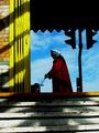
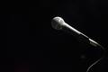
| 09/16/2002 06:00:00 PM |
Silenceby jkiolbasaComment: A lot of mood here for a simple image. Are we waiting for the singer? nice lighting. |
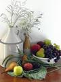
| 09/10/2002 10:50:00 AM |
still lifeby lecookComment: Overkill - First to go is the green napkin, wrong color, introduced yet one more element and texture.Also I think some reflections on the table top might be evvestive but that napkin is in the way. |
| 09/16/2002 02:26:00 PM |
A is for Apple!by ZeissmanComment: Waaay under rated! This is a ten for sure. The butterflies on the bracelet makeit perfect! |
 Photographer found comment helpful. Photographer found comment helpful. |
Home -
Challenges -
Community -
League -
Photos -
Cameras -
Lenses -
Learn -
Help -
Terms of Use -
Privacy -
Top ^
DPChallenge, and website content and design, Copyright © 2001-2025 Challenging Technologies, LLC.
All digital photo copyrights belong to the photographers and may not be used without permission.
Current Server Time: 07/17/2025 07:54:17 PM EDT.