|
|
|
Showing 2151 - 2160 of ~2518 |
| Image |
Comment |
| 12/09/2002 02:30:03 PM | Savannahby GekkerComment: And then what happened? I have one of these also (my fourth) who likes to play bowling pins with people. |
| 12/09/2002 01:03:48 PM | |
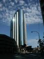
| 12/09/2002 12:52:16 PM | TD bankby awmk1981Comment: Oh, I'm glad I got assigned to review this picture. As it loaded SLOWLY on my dial up connection I thought "Yep, here's the winner!" But then it kept loading all that extra street scene and I was disappointed. I don't think I can add much to what everyine else has said. This is almost a stunning picture and I hope you will recrop it and post it somewhere where we can see it again.
The clouds, the towering bank, the glint of sunshine are visially beautiful and the make such a statement. It looks like a church doesn't it? The modern day icon of what we worship, powerful and imposing and even kissed by the sun. Like a stack of coins propped up an each side by dollars, or whatever bills are used to prop up banks in Bahrain. What a statement for our times.
So take out the scissors and cut it right along that wire thing on the right and take away ALL the street scene, it is too dark anyways. Then clone out the streetlight (yes it's cheating but the challenge is over and you get to make it perfect now). Perhaps t could be brightened up a bit without losing the beautiful blue sky? maybe not. ANd then send it to Fortune Magazine to use as a cover!
This is one great shot and it really deserves to be fixed up a bit! Other than the cropping, the camera angle and the focus and the light, all the photographic decisions were well made. It's all there to make it perfect.
from the Critique Club Message edited by author 2002-12-10 08:14:29. |
| 12/09/2002 12:35:22 PM | JADEby tito79_98Comment: I went with the crowd and gave your picture a 5. The color is nice and the focus is exceptionally fine. Perhaps it would have done better in the stopped motion challenge. Overall its not a very captivating picture. Obviously is it water but it is impossible to tell where the water is coming from and where it is going. The dry area on the upper left is particularly confusing since at first glance it looks like a deep pool that the stream is falling into. What is going on?
Composition wise this does not fit into the categories that the human brain seems to find pleasing. The main focus of the picture is the water, which is centered left right, and where it hits the pool is dead center. Perhaps if you had tried the rule of thirds. I would have put it in the upper left third and taken more advantage of the ripples that the water makes. Also my brain likes to follow the lines in a picture. An effective composition had some sort of pleasing flow. Here there is a strong sense of movement from the top to the center where it goes pffft. Again if it had been moved to the left and up a bit, I ould follow the water in from the left and the ripples out to the right. Of course, you don't HAVE to follow the "rules" and sometimes breaking the rules makes a striking image. I don't think your image is strong enough to stand as a rule breaker.
The glare on the upper left is distracting, was it a flash? Overall I think you should repeat the shot, Maybe you have an out take that is better? you have done a wonderful job of capturing flowing water and the color of the picture is just lovely. The picture could have been sooo much better if it had been framed differently and the ripple emphasized. Could have been a winner instead of falling dead center in the voting range. |
| 12/09/2002 12:15:59 PM | Old Blue-Eyeby IsaacComment: His eyes are definately blue, but this picture doesn't make them look very pretty, does it? If I were your dad I would be mad that you made me look so old. But I think the oldness is what makes it a good picture. The focus is very nice, and even thought you used a flash, the colors came out good. Sometimes the flash makes the colors look washed out or pale. The light is a bit too bright down on his cheek There is a lot of detail in your picture, every little hair shows up, I like the way his eyebrows curl.
To make the picture better, I think the compostiton could have been better. It might be more interesting if the eyeball was looking at the viewer. But then, of course your Dad would have had to look right into the flash and you might have blined him. and gotten "red eye"....so maybe that's not a good idea. How about if you had remembered the rule of thirds and put the eyebal just a bit lower in the picture. I think that would have made it more interesting because the human brain likes to look at things that are about a third of the way on a picture. Yours is one third from the right but it is centered from top to bottom.
A nice portrait of your Dad. Keep up the good work. |
| 12/09/2002 11:56:11 AM | Live Proudby memoComment: Sigh - I thoguht (I still think) this picture was a ten! I like the post processing too. Is this a sign that American patriotism is out? Did it lose points because of the title? What happened? |
| 12/09/2002 11:45:20 AM | Waitingby johnmkComment: I don't get it??!! This was one of my favorite pictures this week! What is it doing way down here???? |
| 12/09/2002 11:43:30 AM | Bowling Gloryby bamasterComment: Boy was I out of synch this weeek. I thought this was one of the BEST!!!!! Well, I still think so! |
| 12/09/2002 11:39:30 AM | |  Photographer found comment helpful. Photographer found comment helpful. |
| 12/09/2002 11:36:42 AM | |
|
Showing 2151 - 2160 of ~2518 |
Home -
Challenges -
Community -
League -
Photos -
Cameras -
Lenses -
Learn -
Help -
Terms of Use -
Privacy -
Top ^
DPChallenge, and website content and design, Copyright © 2001-2025 Challenging Technologies, LLC.
All digital photo copyrights belong to the photographers and may not be used without permission.
Current Server Time: 07/21/2025 12:00:37 AM EDT.
|