| Author | Thread |
|
|
12/09/2002 12:52:16 PM |
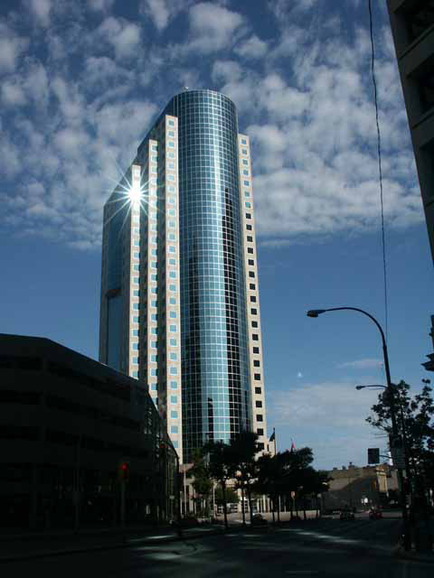
Oh, I'm glad I got assigned to review this picture. As it loaded SLOWLY on my dial up connection I thought "Yep, here's the winner!" But then it kept loading all that extra street scene and I was disappointed. I don't think I can add much to what everyine else has said. This is almost a stunning picture and I hope you will recrop it and post it somewhere where we can see it again.
The clouds, the towering bank, the glint of sunshine are visially beautiful and the make such a statement. It looks like a church doesn't it? The modern day icon of what we worship, powerful and imposing and even kissed by the sun. Like a stack of coins propped up an each side by dollars, or whatever bills are used to prop up banks in Bahrain. What a statement for our times.
So take out the scissors and cut it right along that wire thing on the right and take away ALL the street scene, it is too dark anyways. Then clone out the streetlight (yes it's cheating but the challenge is over and you get to make it perfect now). Perhaps t could be brightened up a bit without losing the beautiful blue sky? maybe not. ANd then send it to Fortune Magazine to use as a cover!
This is one great shot and it really deserves to be fixed up a bit! Other than the cropping, the camera angle and the focus and the light, all the photographic decisions were well made. It's all there to make it perfect.
from the Critique Club
Message edited by author 2002-12-10 08:14:29. |
|
Comments Made During the Challenge  |
|
|
11/25/2002 02:36:34 PM |
|
Beautiful blue building against a georgeous sky. I love the glint on the window, almost like it's winking at you, saying this one's a winner. And it is. PTL 9 |
|
|
|
12/07/2002 11:57:30 PM |
|
Maybe coulda cropped better. Beautiful pic though. |
|
|
|
12/07/2002 12:15:15 AM |
|
Too much distracting stuff for this picture. The idea is great. |
|
|
|
12/06/2002 02:11:25 PM |
|
|
|
12/06/2002 06:20:54 AM |
|
Nice starburst. The surrounding buildings are a bit distracting, but I still like this shot. Jacko. 7 |
|
|
|
12/05/2002 12:16:04 PM |
|
nice star. Seems to have a few distracting elements. Cropping a bunch on both sides(esp the right) and from the bottom would help. |
|
|
|
12/05/2002 09:37:01 AM |
|
good shot from a excellent perspective. |
|
|
|
12/04/2002 11:51:31 PM |
|
I assume the startburst was on purpose, but I find it rather distracting. Similarly with the corner of the building in the foreground on the upper right. Otherwise the composition is great. The brightness could have been turned up a little. |
|
|
|
12/03/2002 10:20:00 PM |
|
A close up crop of the building, sky and star like light would have been so great! Everything else kind of spoils the picture. IMO! |
|
|
|
12/03/2002 10:03:00 PM |
|
This is a good picture. I think I would have liked it better if you could have cropped out the the lights, wire and building on the right side. The building stands by itself. I really like the star reflection and the blue sky. Lnede |
|
|
|
12/03/2002 07:57:00 PM |
|
My personal picture would be just the top of the building plus those nice clouds.Otherwise not a bad shot...5 bullwinkle |
|
|
|
12/03/2002 02:18:00 AM |
|
lol! That lightburst is so perfect it looks like it should be in a movie. Good job. |
|
|
|
12/02/2002 07:02:00 PM |
|
TD.....what is that? Okay this shot is almost a homerun. I really do like it, good sky, the sun flare is very cool along with the glass windows. I'm not crazy for the dark on the left and the dark trees center. Maybe you could of adjusted the levels? ....that or cropped that part out. Still congrats on a neat shot!!! Justine |
|
|
|
12/02/2002 05:06:00 PM |
|
I'd prefer to se more cropping, especially on the right side. |
|
|
|
12/02/2002 04:01:00 PM |
|
I love this shot except for the large dark space in the lower left corner and the upper right. |
|
|
|
12/02/2002 01:11:00 PM |
|
Quite nice architechtural image. IMHO I would have cropped out the right side wire and the upper right corner buiding. Good shot, and it's a nice detail the reflection of the sun on the upper window. |
|
|
|
12/02/2002 11:21:00 AM |
|
not a bad image--street is a little dark--don't like flare but this one's not that bad--powerlines wish we could clone them here--6bobgaither |
|
|
|
12/02/2002 05:17:00 AM |
|
The star look a bit much. A 4 or 6 star would have been better. |
|
|
|
12/02/2002 01:45:00 AM |
|
That glare is great! Whatever that cable is on the right side of the picture is distracting, maybe a closer crop of the buliding would have done better for this shot. I think I would have liked to see the building much closer to the right side of the picture, with more sky to the left. |
|
Home -
Challenges -
Community -
League -
Photos -
Cameras -
Lenses -
Learn -
Help -
Terms of Use -
Privacy -
Top ^
DPChallenge, and website content and design, Copyright © 2001-2026 Challenging Technologies, LLC.
All digital photo copyrights belong to the photographers and may not be used without permission.
Current Server Time: 06/28/2026 09:39:12 AM EDT.