| Image |
Comment |
| 07/22/2003 11:16:36 AM |
Black and Blueby joebarComment: oooh I love it - I think the necklace and the bit of hair are distracting, I thought at first her head had been severed and that was the rough egde. |
| 07/22/2003 11:11:55 AM |
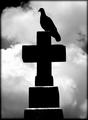
Sunset In Salemby DiversqComment: Watch the border - the red at the bottom draws attention away from the sky and destroys the lovely flow of the clouds. All black would have been less distracting. |
 Photographer found comment helpful. Photographer found comment helpful. |
| 07/21/2003 10:41:36 AM |
|
| 07/21/2003 10:38:22 AM |
|
| 07/21/2003 09:56:05 AM |
|
| Photographer found comment helpful. |
| 07/16/2003 02:48:51 PM |
Mellow Yellowby seabrookComment: ugh - I hate the yellow nai polish, focus is tooo soft, feet are too dark and black and blue. Okay, now start over. This is a ggod concept. the composition is more interesting than many, the interplay of negative and ositive space is interesting. With that much black space I think maybe this would be much improved by changing to black and white, The color doesn't add, the shapes are the strong point. B+W would make the sapes more abstract. |
| 07/16/2003 02:43:15 PM |
Untitledby ChiquiComment: A great idea which could have been better. First fix the wrinkly sheet, then pose those terrific boots better. Take a black marker and make her tattoo really black so it stands ot more. Get another light to kill the shadow by her leg an arm. I really like this and I think you should play with it some more. it is soooo close to being a stunning photo - 6 |
| 07/16/2003 02:38:40 PM |
HM-Torso Studyby Chilly0999Comment: I like everything here but the straight on composition. The light, colors, soft focus are all wonderfull but posing him like that makes the picture boring and worse, I keep seeing a happy face with his nipples the eyes with dark shadows, the bellybutton the mouth and the lines of his stomach a smile with dimples. ...Or did you mean it to be a face? |
| Photographer found comment helpful. |
| 07/16/2003 02:33:38 PM |
Body Artby mbardeenComment: Hmmm. Am I voting on the photo or the tattoo? Tattoo gets a ten, Photo an 8, The lighting is maybe stark, the ink on the tattoo too dark. Nice negative space shapes. The best shape of all ths the V of white skin in the middle of the tattoo. I like that vulnerable white neck space contrasted with the harsh new tattoo/pain. the wisp of hair is nice too and the backs of the ears, maybe the arm competes with it because the arm seems strong? 8 |
| Photographer found comment helpful. |
| 07/16/2003 02:23:22 PM |
Fetish Dreamsby sunflowerComment: This is wonderful, as you well know! The sof focus is lovley the colors are enticing, the beads make wonderful lines for the eye to follow, the curve of the instep is sensual. The purple roses are a bit hard to make out, they look like psychedelic swirls and compete with the subject just a bit. I hope this gets a ribbon!!!! |
| Photographer found comment helpful. |
Home -
Challenges -
Community -
League -
Photos -
Cameras -
Lenses -
Learn -
Help -
Terms of Use -
Privacy -
Top ^
DPChallenge, and website content and design, Copyright © 2001-2025 Challenging Technologies, LLC.
All digital photo copyrights belong to the photographers and may not be used without permission.
Current Server Time: 07/28/2025 10:46:51 PM EDT.