|
|
|
Showing 851 - 860 of ~4457 |
| Image |
Comment |
| 07/30/2007 11:22:08 AM | Portrait of a Personalityby MamaPhotoGeekComment: Greetings from the critique club :)
Well first of all I think it meets the challenge, no doubt. However, this is one of those photos I would just vote a 5 and move on to the next photo without commenting. It´s simply not a good photo but it´s also far from bad. It´s to me just a snapshot of a kid I don´t know, sure, would look good in the family album but it doesn´t say anything to me. The girl is of course very cute and you caught a good moment there, but still, the image has got a very snap-shotish look to it.
I totally agree with all three comments you got during the challenge, I also couldn´t make out what was in ther mouth until I read your comment about the photo and I also think the backround is distracting.
Ooops, hit "post" before I was finished, anyway, to continue...
Again, this is not a bad photo but the almost centered composition, the paper in the mouth and that chair that is so prominent in the backround just are not really winning me over and I suspect many people did what I would have done, voted a 4-6 vote and just moved on to the next photo. What you need to do to really do well in challenges here is simply to blow the socks off the voters and make your image memorable or connect to them in some way. Best way to do that is for starters have the subject look at you when you are shooting a portrait and try to have the photo as simple as possible, focus on eyes, no distracting objects like the paper or the chair in the backround.
Just keep at it, this is a nice start at DPC and far from bad so I hope to see more from you in the future, welcome to DPC!
Kind regards from Iceland, Lárus. Message edited by author 2007-07-30 11:26:53. |
| 07/30/2007 11:17:48 AM | hippie flowerby dudeman13Comment: Greetings from the critique club :)
Sorry, I see this came in last place and well to be brutally honest, I am not surprised. Why?
I can´t even make out what it is in the photo but it looks like a flower and not paper. Whatever was done to this image in post processing is not even close to being to my taste and frankly, as a photograph for this particular challenge, I would have voted this a 1 for the post processing effect and the fact that I can´t make out any paper in this image.
This might definately be some people´s cup of tea though as I see quite a bit of the voters gave this a 6 or higher score, the image is very artsy and if you like this, just ignore me for I am usually one of those who don´t understand abstract art. Keep at it but do not expect high scores at DPC with images in this style :)
Kind regards from Iceland, Lárus. |  Photographer found comment helpful. Photographer found comment helpful. |
| 07/30/2007 09:34:59 AM | The way is straight, and the path is wrought fair... by DrAchooComment: Hey on second thought, since it´s only two and a half hours away, I challenge you to make a sesonal series of this exact same shot, go there again in the fall when the fall colors are there, a winter shot then with no leaves and do anoter in april to see if you get the same colors as Charlie.
Think those three photos + this one would look great side by side, think about it dude, I know I would do it ;) | | Photographer found comment helpful. |
| 07/30/2007 09:32:25 AM | Money Hungryby JasonMooreComment: Greetings from the critique club :)
Wellcome to DPC for starters. This is a pretty nice beginning and I don´t really understand why it didn´t score better. I mean, the lighting is good and looks very natural so great job there. The DOF and focus are spot on, frankly technically this image is very well done so you obviously have the camera details down. I also like the idea and it´s pretty well executed.
However, I was thinking the same thing as some of your commenters say, that you should have shredded real (or fake) money instead of white paper. It would have been pretty easy to use a photocopier to copy money and even though they would have been b/w then you would just have colored the fake shredded money green in photoshop since this is an advanced editing challenge. It just would have made the photo MUCH stronger. That or use something other than white paper to shred, like something you would usually shred like cheeze or potatoes or stuff like that so it just looked like you were putting dressing on the main food wich was then the bills.
Anyway, great start and I think this was seriously underrated, I personally would never have given a lower rating than 6 so keep at it, you´ll fit in nicely here after the adjustment period :)
Kind regards from Iceland, Lárus. | | Photographer found comment helpful. |
| 07/30/2007 07:55:25 AM | papelby booboo_goonComment: Greetings from the critique club :)
Well I don´t really know what to say about this image so I´ll start with that I really like it. I am not big on minimalism but this one is very well done in that genre and if I had voted I probably would have given this a 7. It´s well lit, easy on the eyes, well done compositionally and of course meets the challenge very well. I do understand that people voted it low though, usually to impress the DPC voters you need something that looks like it took a lot of effort and gives off that "wow" factor that is so elusive.
I do not think you should worry what other people think as you comment after the challenge was over, if you like photos like this, just keep on entering them and think that 63 people gave it a 7 score or higher so they must have really liked it and ignore the one´s that gave a 4 or lower. There is more to photography than scoring well and winning ribbons on DPC :)
Kind regards from Iceland, Lárus. | | Photographer found comment helpful. |
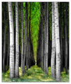
| 07/30/2007 07:24:31 AM | G R E e Nby heavyjComment: Greetings from the critique club :)
First off, regards to meeting the challenge, this photo does that easily and I doubt anyone disagrees with that assessment.
My biggest gripe with it is the lack of focus on the eyes, I always think you should focus on one or both of the eyes and you don´t do that in this shot wich I am sure you did on purpouse but doing that isn´t to my taste. Also I am a fan of the big space above her but think you overdid it a bit, if you had lowered the frame just a bit so her head wouldn´t be in dead center, this picture would have looked a whole lot better compositionally.
The rest is pretty good, I like that I am looking up at her, the clothes colors vs. the backround colors work nicely, the light is good and so is the exposure, think you should have used iso 200 and 1/80th shutterspeed to eliminate any chance of camera shaking but that´s just me, the 1/40th seems to have worked this time so you must have steady hands. DOF is nice, except for that I was griping about earlier about the focus not being on her eyes, and bokeh is good.
All in all a pretty good shot and I think it ended up pretty much where it should end, almost a perfect 6.000 score and I would have voted a 6 if I had voted.
Kind regards from Iceland, Lárus. | | Photographer found comment helpful. |
| 07/30/2007 07:06:44 AM | Cowboy Upby neophyteComment: Greetings from the critique club :)
Well first of all, this definately meets the challenge, no doubt. I do like the lighting, maybe a bit harsh but still pretty good. I am not sure b/w was the way to go here, I do like the b/w conversion, it´s got great tones in it and looks cool but I just get this impression that the colors in this shot would have made it pop a bit more. Most of all, the hat and overall would have looked nicer in color I am sure, but the backround was maybe too prominent in color so that´s why you chose to make it b/w? Anyway, not sure it would be better, it´s just the impression I got.
Composition is not bad but maybe a bit too centered, had you taken this a bit wider and shown more of his surroundings, keeping him in the left corner of the photo, would it have been better? Maybe showing this dude in the dunk tank would have gotten you a better score, I am not sure. Anyway, this is a pretty nice photo and I think it should have scored a bit better but maybe the reason it didn´t is cause it´s not really memorable or stands out from the rest like it could have done had you maybe shown more of the surroundings.
Kind regards from Iceland, Lárus. | | Photographer found comment helpful. |
| 07/30/2007 06:38:11 AM | Baby Blue Eyesby Delta_6Comment: Greetings from the critique club :)
As a parent, I don´t often know what to say on pictures of other peoples kids so I might keep this a bit short.
I think this shot was pretty underrated in this challenge but then again I can guess on why it didn´t do better. First off, the lighting doesn´t really look natural, I personally would have given you the benefit of the doubt but it looks like you lit it with some side lighting, like a monolight or off camera flash. Like I said, I would have given you the benefit of the doubt but a lot of DPC voters are pretty anal when it comes to things like this and would certainly have voted it down for that.
Secondly, this baby is extremely cute and has a lovely smile, definately a photo to put in the family photo album for years to come. However, it´s not really something I haven´t seen or photographed before and while this is a treasure for you and the baby´s family, for other people this is simply a snapshot of a very cute baby, there are a lot of cute baby snapshot´s on DPC and I guess some people are tired of seeing them and vote down because of that. I am not fed up, far from it since I love kids and me and Henný are probably not done yet, but if you want a better score, try to make your baby photos a bit less "snapshot-ish" :)
Kind regards from Iceland, Lárus. Message edited by author 2007-07-30 07:17:43. | | Photographer found comment helpful. |
| 07/30/2007 06:25:06 AM | Somnolentby KaliComment: Greetings from the critique club :)
As a parent, I always get a little bit lost for words when I am commenting on photos of children so I am going to keep this pretty short.
First off, congratulations on your new baby! I remember those first days very vaguely, funny how our minds only remember them sleeping like this and not of them crying their lungs out, hehe :) Has got me and my wife thinking about making another one and Alexander is not even 5 years old :P
This photo definately meets the challenge, I like the shallow DOF and that you decided to make this b/w. I am not really fond of the way you did convert it to b/w though, did you use the channel mixer and a lot of the red channel and very little of the green and blue channels? I just feel like this image looks a bit too "Infra Red" to my personal taste. It´s a minor detail though but I think I would have liked it even better if you had a little less IR look to it and had used more of the green channel while b/w converting it. Perhaps I am wrong and you got this IR look some other way, by perhaps dodging/burning but in any case, I think I would have preferred the image with some other b/w look.
Lighting is nice, as is the composition and DOF like I said earlier. Both of your expressions are memorable and sincere and they always look like little angles when they are sleeping :)
Kind regards from Iceland, Lárus. | | Photographer found comment helpful. |
| 07/30/2007 06:14:17 AM | Facing The Futureby equinox2009Comment: Greetings from the critique club :)
Well sorry, there is not much I can say about this image but echo most comments you already got.
First off, this is not a portrait as 99% of the DPC voters or most people would define a portrait, a portrait to me is of a living thing, most often a person. Not a picture of a statue. That would explain the extremely low score most people gave this picture.
Secondly, if you do not make the most of the allowed 640 pixles you get here at DPC, your score will also suffer, simply because it´s hard for people to see the image well compared to 99% of the other photos in the challenge.
Thirdly, the image quality is not very good, the image seems blurry and perhaps out of focus (hard to tell since it´s so small) and the sunset got badly blown hightligths.
The photo does have one thing going for it, I do really like the composition, nicely done and I like the negative space around the statue.
Again, sorry but if I had voted, I probably would have been one of those people who voted you a 1 and not because this is a bad photo but it simply doesn´t meet the challenge and is also so small and of poor image quality.
Kind regards from Iceland, Lárus. |
|
Showing 851 - 860 of ~4457 |
Home -
Challenges -
Community -
League -
Photos -
Cameras -
Lenses -
Learn -
Help -
Terms of Use -
Privacy -
Top ^
DPChallenge, and website content and design, Copyright © 2001-2025 Challenging Technologies, LLC.
All digital photo copyrights belong to the photographers and may not be used without permission.
Current Server Time: 08/13/2025 11:42:22 PM EDT.
|