| Image |
Comment |
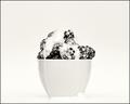
| 10/08/2005 09:19:08 PM |
Berries and Creamby joezlComment: Nice job with the lighting, I like that this image is high key. I still think I would have liked this better in colour since it´s a bit flat but one of the stronger shots in this challenge, I gave it a 7. |
 Photographer found comment helpful. Photographer found comment helpful. |
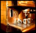
| 10/08/2005 01:32:55 PM |
Double Shot by DrAchooComment: Painted with light? Anyway, however you did this I like the look, wether that be from painting with light or PP. 8 from me. |
| Photographer found comment helpful. |
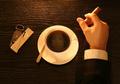
| 10/08/2005 01:27:36 PM |
Missing you... by MirceaComment: Wow, at first I didn´t notice the face in the coffee, I just clicked on "6" and went on to the next image but I felt I missed something so I came back and there it was and it really makes this image "pop". Bumped up to 8 and well if the WB wasn´t so yellowish and the lighting a bit softer I might very well have given this a 10... Nice work, hope most people noticed the face in the coffee, I have a feeling this might not score so well if they don´t notice it... |
| Photographer found comment helpful. |
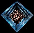
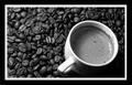
| 10/08/2005 01:24:02 PM |
Symmetry of Coffeeby magueroComment: Nice symmetry, gives those beans some interest apart from the tons of other shots with beans in them. Lighting is a bit harsh though for my taste as you have some overexposed glare on some of the beans and also a shame this is a basic editing rules challenge as the white stuff on the backround is a bit distracting but other than that, very cool and one of the best in the challenge, gave this a 7. |
| Photographer found comment helpful. |
| 10/08/2005 01:21:40 PM |
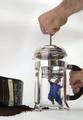
rock starby parrotheadComment: Nice, one of the best entries in the challenge and I gave this an 8 in accordance with that and this is pretty flawless as an image, could very well be in a commercial as far as I am concerned, except for one thing. I don´t know what it is specifically but the skintone isn´t very flattering, either it´s noise or wrong WB or something, it just looks oddly reddish, especially the hands, did you underexpose this shot and bring it back with shadow/highlights cause that might explain it? Everything else is spot on, the focus, sharpness, colours and composition. |
| Photographer found comment helpful. |
| 10/08/2005 01:17:38 PM |
Caffeine Nightmareby snsComment: Lol! Nice idea Daniel, you never cease to amaze me what you can pull out of your hat withi these basic editing rules, my hat goes off to you and I wouldn´t be surprised to see this close to, or even on top of this challenge. Gave this an 8. However, I must make one slight comment about the contrast in the image, to me it seems a bit flat, perhaps a slight "s-curve" would improve this a little bit? |
| 10/08/2005 01:13:15 PM |
Top Quality Caféby patrinusComment: I think this is the best "cup with coffee beans" shot in the challenge, I love the texture in the shot and gave this a 7. |
| Photographer found comment helpful. |
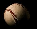
| 10/08/2005 01:11:32 PM |
Baseballby hstegComment: Wrong challenge? A shame cause this shot is well lit, makes an boring baseball a bit interesting and makes me wonder about the history behind the ball but sorry, I don´t get how this ties in with "coffee shop" at all so I only gave it a 2, would probably have given this a 7 if it fitted the challenge IMHO. |
| Photographer found comment helpful. |
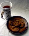
| 10/08/2005 01:08:29 PM |
Mmmmmm!by Ice-Tea-1983Comment: Two things I don´t like about the picture.
1. The cup is blocking the lightsource from getting to the cookies and that makes them a bit drab and lacking in texture, I would have liked this shot better if the cup were in the top right corner, not the top left.
2. The backround isn´t exactly fitting with the challenge theme, makes it pretty obvious that you took this at home since it´s just a wrinkled sheet but I didn´t vote as it was off topic.
I like the rest, the lighting is good (if you exclude the cup in front of the lightsource bit), the image quality is good, the colours, sharpness and contrast and composition is above average. Gave this a 6. |
| Photographer found comment helpful. |
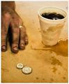
| 10/08/2005 01:05:33 PM |
35 cent refillby mpetersComment: I would have liked this shot a whole lot better if the hand and cup were in the same focus as the coins, just having them slightly out of focus like that makes me want to squint my eyes just to see them better and it irritates me. Having said that though I like everything else about the shot, the lighting, the composition, the "feel" and colouration and gave this a 7. |
| Photographer found comment helpful. |
Home -
Challenges -
Community -
League -
Photos -
Cameras -
Lenses -
Learn -
Help -
Terms of Use -
Privacy -
Top ^
DPChallenge, and website content and design, Copyright © 2001-2025 Challenging Technologies, LLC.
All digital photo copyrights belong to the photographers and may not be used without permission.
Current Server Time: 08/14/2025 08:38:41 AM EDT.