| Image |
Comment |
| 10/11/2005 08:49:24 PM |
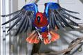
Celebrate Pets that Flyby donnievComment: Sure, why not, who doesn´t like pets that fly. This shot however isn´t really working IMHO as the focus is on the door in the backround and not the bird so I frankly gave this a 4, had it been the other way around I would probably have given this a 6 or even a 7 but it´s hard to tell. Oh well, at least the timing was right, hope you get the focus right next time. |
| 10/11/2005 08:48:02 PM |
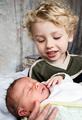
Shock of the Newby ImagineerComment: I don´t really get the title, the older boy doesn´t look shocked but more intrigued by what I presume is his brand new sibling. Anyway, I assume these are your kids and congratulations with your new born baby. I like this shot a lot, VERY well lit and sharp as a tack and very well fitting for the challenge, wouldn´t be surprised to see this in the top 10. 8 from me. |
 Photographer found comment helpful. Photographer found comment helpful. |
| 10/11/2005 08:46:08 PM |
Before the gameby whiteroomComment: Nice candid, very well exposed and I like the b/w conversion technique, one of the better shots in the challenge, 7 from me. |
| Photographer found comment helpful. |
| 10/11/2005 08:44:20 PM |
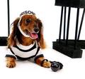
Sweet Freedomby idnicComment: Lol! Who would put a cute fellow like that in prison, I bet he got out early because of the puppy dog look in his eyes. Nicely lit even though there are a couple of blown highlights. 7 from me. |
| Photographer found comment helpful. |
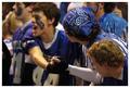
| 10/11/2005 08:41:37 PM |
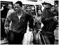
Touchdown!by ttreitComment: No offense but this choice in where you put the DOF is baffling me, this shot would have been soooo much better if the focus were on the guy who´s face is turned up into the camera (the guy with the paint in the face in the #44 shirt) but other than that pretty good and fitting for the challenge. |
| Photographer found comment helpful. |
| 10/11/2005 08:38:51 PM |
Because it's Fridayby fstopopenComment: Nice candid moment but I would have liked this a whole lot better if I could see her face but still above average in the challenge so I gave this a 6. |
| Photographer found comment helpful. |
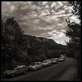
| 10/11/2005 08:37:46 PM |
Being on the good side of the roadby jjbeguinComment: Lol! Aint that the truth, did all of these drivers pose for you :P
The photo is nice but I have a tingling feeling I personally would have liked it better in colour as it makes this a bit flat in sepia as the different colours of the cars would have directed the attention to them. Also I have to say that you did a sloppy work with darkening the sky, there is a very visible halo around the trees and cliffs. Anyway the composition is nice and this is definately above average in the challenge, I gave this a 6. |
| Photographer found comment helpful. |
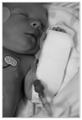
| 10/11/2005 08:07:44 PM |
Intravenous Beverageby tcmartinComment: Greetings from the Critique Club :)
Firstly I want to congratulate you and the parents on this new and welcome addition to the family. Hopefully everyone is well and "wireless" as you youself said, it breaks my heart just imagining either one of my kids in the hospital so this photo makes me a little bit sad.
Anyway, down to buisness. I gave this shot a 5 in the challenge when voting. There are several reasons why I didn´t give it a higher score and the first one is the focus. I can´t really see any one point in pinpoint razor sharp focus except for her left hand and that drags the picture down a notch for me personally for as with most peope I immediately look for the eyes and face when looking at a photograph of a person and here it is out of focus.
The lighting is ok, I assume you used ambient light for this as I see the settings on your camera are 1/80, f1.8 and iso 200. This works pretty well, there are no strong shadows or blown highlights but the photo looks slightly underexposed, take this with a grain of salt though as I have a crappy monitor and I didn´t verify this by looking at the histogram. Anyway, I personally would have liked this shot better if you had managed to brighten it up a little bit without blowing out the highlights on the bandages on her arm.
The composition is good, a little cramped but it works for me and fits this shot. So is the contrast in the shot, her skin tones contrast nicely with the bandage and I looked at your profile and you seem to know what you are doing so I trust in your judgement in making this b/w and not colour.
As for fitting with the challenge, I voted as it did so (otherwise I would probably have given this a 2 or a 3) but I think I have a very open mind as regarding wether a shot fits with the challenge or not and I still think it´s in a gray area as what I normally consider a beverage is something that you drink through your mouth... Anyway, I guess a whole lot of people thought otherwise and that this didn´t fit the challenge and I have to say that I understand them and that probably accounted for the relatively low score.
Anyway, that´s all I have to say for this picture and again, congratulations on your newest member of the family, I sincerely hope everyone is well.
Kind regards, Larus. |
| Photographer found comment helpful. |
| 10/09/2005 05:22:34 AM |
|
| Photographer found comment helpful. |
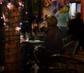
| 10/08/2005 09:21:06 PM |
Breakfast at Clarke'sby Keith ManiacComment: Composition a bit too cramped for my taste, I would have liked to see a little bit more space around her head, specifically above it and to her right but other than that, very nice work. Excellent job on the b/w conversion, the skin tone is good and technically everything is good. 7 from me. |
| Photographer found comment helpful. |
Home -
Challenges -
Community -
League -
Photos -
Cameras -
Lenses -
Learn -
Help -
Terms of Use -
Privacy -
Top ^
DPChallenge, and website content and design, Copyright © 2001-2025 Challenging Technologies, LLC.
All digital photo copyrights belong to the photographers and may not be used without permission.
Current Server Time: 08/14/2025 03:55:44 AM EDT.