| Image |
Comment |
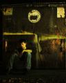
| 11/10/2005 09:47:44 AM |
Cast Outby wavelengthComment: I don´t know what it is but I like this photo, perhaps it´s the grittyness of it and the noise is actually adding something to the picture and I normally hate noise. 7 from me. |
 Photographer found comment helpful. Photographer found comment helpful. |
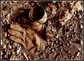
| 11/10/2005 07:43:23 AM |
Biohazardby EricMGB1974Comment: Nice, one of the better shots in the challenge and I would even go so far as to say that this would pretty much be safe in the top ten, there is something odd about the syringe though, it´s a wierd purple colour and it kindof drags down the shot but other than that, good work. 8 from me. |
| Photographer found comment helpful. |
| 11/10/2005 06:45:15 AM |
|
| Photographer found comment helpful. |
| 11/10/2005 06:43:05 AM |
|
| Photographer found comment helpful. |
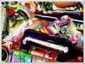
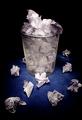
| 11/10/2005 06:40:29 AM |
Mr. Warhol's Discarded Sodaby tpocComment: This whole image is just to busy for my taste, nothing really grabs the eye and mine just wanders all over the frame. Certainly fits the challenge though and I like exaggerated cartoonlike colours, fits with the shot. |
| Photographer found comment helpful. |
| 11/10/2005 06:38:05 AM |
|
| 11/10/2005 06:32:26 AM |
Imagine your lungsby elee3009Comment: A little too high contrasty and grainy for my taste but kindof fitting for the subject and as a non smoker I totally get your message with this shot. 6 from me. |
| Photographer found comment helpful. |
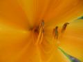
| 10/28/2005 11:09:46 AM |
Blooming Delicacyby ernaComment: I don´t completely understand your choice of focus on this picture, it seems that your focus plane is somewhere in between objects in this frame and frankly I find it very disturbing and this is not an image I find pleasing to look at. Colours seem good though but a bit flat, a small curves adjustment would improve this heaps. Meets the challenge though so I gave it an 4. |
| Photographer found comment helpful. |
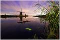
| 10/28/2005 06:28:14 AM |
Painted Skyby PhilosComment: Hmmmmmmmmmmmmmmmmmmmm, wonder who is the photographer of this shot? :)
I like the shot itself but 2 reasons why I didn´t vote particularly high. I am not really that fond of the grass on the right side and think I would have liked it better without it but it´s not really KILLING the shot, just draws too much attention from the lake and windmill and sky.
The other reason is that this doesn´t really speak "delicate" to me and I think it´s in a gray area regarding meeting the challenge but what the hell... Still a nice shot and I gave it an 6. |
| Photographer found comment helpful. |
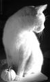
| 10/28/2005 06:21:36 AM |
Untitledby buddybuddy1226Comment: Looks like you need to be more careful with blowing out highlights, large portions of the cat´s fur is completely white without any trace of any texture, other than not a bad shot but it doesn´t really speak "delicate" to me so I was going to give it a 5 but I deducted 1 point cause of the severe blown highlights. Like the composition though. |
| Photographer found comment helpful. |
Home -
Challenges -
Community -
League -
Photos -
Cameras -
Lenses -
Learn -
Help -
Terms of Use -
Privacy -
Top ^
DPChallenge, and website content and design, Copyright © 2001-2025 Challenging Technologies, LLC.
All digital photo copyrights belong to the photographers and may not be used without permission.
Current Server Time: 08/14/2025 02:27:03 PM EDT.