| Author | Thread |
Comments Made During the Challenge  |
|
|
11/14/2005 12:48:30 PM |
|
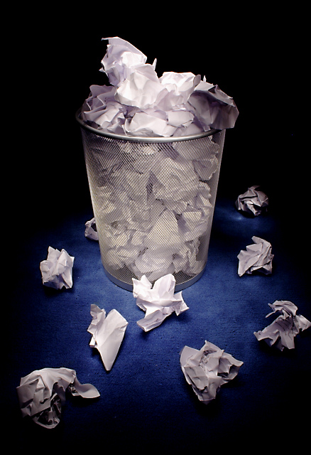
I like the lighting and crispness of focus. I hope you recycled! :) Good luck. |
|
|
|
11/13/2005 07:38:08 PM |
|
|
|
11/13/2005 12:58:02 PM |
|
Very simple and clean image. |
|
|
|
11/11/2005 05:21:09 AM |
|
I like this image. The lighting gives the contast more impact. It holds the eye longer - demands attention. |
|
|
|
11/10/2005 06:46:41 PM |
|
fun idea, like the lighting. |
|
|
|
11/10/2005 01:57:28 PM |
|
The lighting really makes this shot. Well done. |
|
|
|
11/10/2005 06:38:05 AM |
|
Nicely lit, makes an ordinary wastebasket interesting. Gave this a 7. |
|
|
|
11/09/2005 09:47:40 PM |
|
I like the set up and the crispness of the colours in this photo, very nicely done in my opinion. |
|
|
|
11/09/2005 03:38:39 PM |
|
nice. i think it'd look more authentic if the papers looked more used, and written on. it looks like it was setup. which most pictures are, but i think that some minor adjustments would make this picture do alot better. good job |
|
|
|
11/09/2005 02:05:26 PM |
|
|
|
11/09/2005 01:37:56 PM |
|
Hey... that's an Ikea garbage can, isn't it? I have an identical one in my computer room. I remember buying it right after the last Garbage challenge! I like the shot a lot, by the way... :) - 9 |
|
|
|
11/09/2005 05:11:43 AM |
|
Your set up would have appeared more realistic if there had been some printing or writing on the pieces of paper. The darkness in the bottom corners of the picture seems visually annoying for some reason. It is a good idea for the challenge. |
|
Home -
Challenges -
Community -
League -
Photos -
Cameras -
Lenses -
Learn -
Help -
Terms of Use -
Privacy -
Top ^
DPChallenge, and website content and design, Copyright © 2001-2026 Challenging Technologies, LLC.
All digital photo copyrights belong to the photographers and may not be used without permission.
Current Server Time: 06/29/2026 10:42:32 AM EDT.