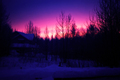
| Image |
Comment |
| 01/04/2007 07:35:00 PM |
Alaskan Daylightby AkchasComment: Well this is a bit too dark for my taste but I do like the sky so I voted a 6. |
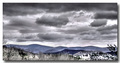
| 01/04/2007 07:34:39 PM |
Impending stormsby CamComment: I have a hard time saying anything about this shot as I find it neither good or bad, the composition is nice but I would have liked it better if it had stronger contrast. 5 from me. |
 Photographer found comment helpful. Photographer found comment helpful. |
| 01/04/2007 07:26:48 PM |
Tempestby elsapoComment: This shot is very nice but I gotta say, that lightning looks really out of place and I actually knocked this shot down a point for it, this shot would have been stronger without it. That´s it though, the rest of the shot I really like and I voted an 8, great job. |
| Photographer found comment helpful. |
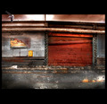
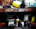
| 01/04/2007 07:25:40 PM |
Chemical Shelfby littlegettComment: Well this is pretty good, I like the strong contrast and the colors in this. You have probably gotten comments about the yellow can or oxygen tank in the top beling blown out and also the box next to it and all I can say is I definately agree that it kindof knocks this shot a bit down as it just draws too much attention to it. Still above average and got a 6 from me. |
| Photographer found comment helpful. |
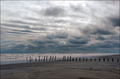
| 01/04/2007 07:20:16 PM |
Lostby GolferDDSComment: I have a hard time saying anything about this shot as I find it neither good or bad. I like the color of the foreground, dislike the bland grey sky and the lack of a strong subject that pulls at my attention. 5 |
| Photographer found comment helpful. |
| 01/04/2007 07:19:18 PM |
[Desert Waste]by runin2dsonComment: This shot is nice but I have a feeling it is one of those shots that needs to be BIG up on a wall to pop, it just doesn´t do that in web resolution. 6 from me |
| 01/04/2007 07:17:06 PM |
Delapidatedby hotpastaComment: Well three things that I dislike about this shot.
1. The black top and bottom just don´t make sense to me, don´t really care for them.
2. The seagull looks totally fake and out of place, don´t get why you put it there.
3. The selective blurring, especially on the left side of the photo are not making this a better photo in my opinion.
I do like the grain and coloring and the look of the image though and voted a 6 in spite of all three issues I have with this shot. |
| Photographer found comment helpful. |
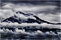
| 01/04/2007 06:55:28 PM |
Snowboundby SJCarterComment: Well I bet you are getting hammered for the frame and I must say, understandably so. I usually never complain about frames but this one does nothing than draw attention from what I consider a pretty good photograph. I like the shot, excellent tones in it and love the subtle colors. 7 |
| Photographer found comment helpful. |
| 01/04/2007 06:54:08 PM |
Its Getting Hot In Hereby MRubilloComment: Well I always am demanding on photos of fire and want to see clear cut texture and detail in them and not blown out, this is close but not quite there. Not bad though but I demand better :) |
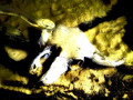
| 01/04/2007 06:44:54 PM |
Golden Deathby KelliComment: Well this shot would have appealed so much more to me if there was some detail left in that skull, usually I don´t care about blown highlights but when it´s so far gone as in this picture... Sorry but the image quality is just not for me, gave it a 3. |
| Photographer found comment helpful. |
Home -
Challenges -
Community -
League -
Photos -
Cameras -
Lenses -
Learn -
Help -
Terms of Use -
Privacy -
Top ^
DPChallenge, and website content and design, Copyright © 2001-2025 Challenging Technologies, LLC.
All digital photo copyrights belong to the photographers and may not be used without permission.
Current Server Time: 08/24/2025 01:32:43 PM EDT.


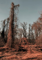
![[Desert Waste]](https://images.dpchallenge.com/images_challenge/0-999/607/120/Copyrighted_Image_Reuse_Prohibited_443792.jpg)