| Image |
Comment |
| 05/15/2003 08:41:45 PM |
Unwrappedby friscaComment: Nice shot. I like the composition here. The lighting is too harsh though. It is reflecting too brightly on the front yellow portion of the box. The red ribbons in the back are a little dark. I also see some blue in the black front portion. Can't understand what that is. |
 Photographer found comment helpful. Photographer found comment helpful. |
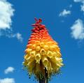
| 05/15/2003 08:38:37 PM |
TRICOLORby mikemtiComment: Interesting. Was this the actual color of the flower? The bottom yellows are a little too light and bright. I think i would have tried a different crop or perhaps a different angle on this. It's good, but something is missing. Good color and contrast on the sky. |
| 05/15/2003 08:36:07 PM |
Out come the heroesby johnmkComment: Nice idea, and good DOF. The shadow on the upper portion takes away from the photo. The harsh lighting on the bottom is too bright. It is quite difficult when dealing with dirrect sun light as seems to be the case here. |
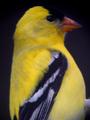
| 05/15/2003 08:33:33 PM |
Goldfinchby SwashbucklerComment: This is nice and close but it lacks the sharp focus necessary on such a close up shot. Your camera might not be able to focus at such a close range. Keep trying. |
| Photographer found comment helpful. |
| 05/15/2003 08:31:34 PM |
Yuck, this isn't Dandy!by SonifoComment: Really cute shot. The color, composition and focus are all good. I think I might have tried a shorter DOF to blur the background. The object in the right center is a little annoying and the fingers are a touch too light. Love the eye contact, adds a great feel! |
| Photographer found comment helpful. |
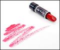
| 05/15/2003 07:14:13 PM |
Cinnamon Redby StevePaxComment: I like this idea. looks like an ad. I would have used a different lipstick to make the shot look more glamorous though. Wet n Wild just doesn't cut it :) Seriously though, the color on the paper is a little too magenta in color but great composition. |
| Photographer found comment helpful. |
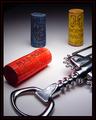
| 05/15/2003 07:10:23 PM |
Vino Italianoby jmsetzlerComment: Nice shot. I really like the lighting on the background. Great focus. I think I would have preferred the red cork all in the shot and a little more light on the blue cork. Nice framing too. On closer examination, are those wine drops on the white? I know we can't clone :( |
| 05/15/2003 07:05:37 PM |
Butterfly Fantasy by dsidwellComment: Nice idea. I like the composition. There is something in the lower left that is bothering me. A touch too dark, but good shot overall. |
| Photographer found comment helpful. |
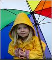
| 05/15/2003 07:02:52 PM |
Rain, Rain, Go Away!by DougPazComment: Very nice... the colors, exposure and softness are super. I'm curious as to the camera used. Great that there are drops on the umbrella. Would have loved to see her holding it though(I am so picky). Also would have prefered no grass showing. |
| Photographer found comment helpful. |
| 05/15/2003 06:56:45 PM |
Primary Glass by JackoComment: yes I have seen this before...
well done, my only complaints are that the colors are oversaturated and the line at the bottom is not quite straight. |
| Photographer found comment helpful. |
Home -
Challenges -
Community -
League -
Photos -
Cameras -
Lenses -
Learn -
Help -
Terms of Use -
Privacy -
Top ^
DPChallenge, and website content and design, Copyright © 2001-2025 Challenging Technologies, LLC.
All digital photo copyrights belong to the photographers and may not be used without permission.
Current Server Time: 08/02/2025 05:09:46 AM EDT.