| Image |
Comment |
| 05/15/2003 11:47:05 PM |
Primary Peppersby ToddhComment: nice colors. The focus is a little too soft in my opinion. Would have liked to see a stem on the yellow one. The blue looks a little noisy, it could be a little oversaturated. i like the composition. |
 Photographer found comment helpful. Photographer found comment helpful. |
| 05/15/2003 11:44:18 PM |
Blendingby severinComment: very original...nice shot. Background has a slight red tone to it, would like it to be a deeper black. Colors are a little noisy, probably couldn't avoid it with the technique you used. |
| Photographer found comment helpful. |
| 05/15/2003 11:36:49 PM |
Running Coloursby pinbackComment: Nice action shot...how many tries did it take/ The colors are very good, except the black could have been richer. Lighting is good also. |
| Photographer found comment helpful. |
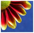
| 05/15/2003 11:34:33 PM |
Petals by agwrightComment: Nice closeup...your colors are oversaturated and the contrast is a little too high. There are dark shadows in the petals. You need to play with your light source to get a little more light on the flower, instead of using programs to adjust. Or maybe you used a flash/ They are too harsh on a closeup like this. I am only guessing that this might be the problem. The composition is good, the bckground color is good. |
| Photographer found comment helpful. |
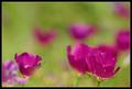
| 05/15/2003 08:59:25 PM |
Impressionist canvasby GordonComment: I really like this. My photo of this week is similiar. i like your use of DOF. Good colors. I think i would prefer the main bloom to face into the photo instead of out and be a touch higher. This is in my top pics. |
| Photographer found comment helpful. |
| 05/15/2003 08:55:54 PM |
Purpleby arnitComment: Nice portrait. Good lighting and contrast on both the model and background. My one tiny complaint is that her farhead is a little too purple. |
| Photographer found comment helpful. |
| 05/15/2003 08:46:09 PM |
|
| Photographer found comment helpful. |
| 05/15/2003 08:44:46 PM |
Welcome Home, Troops!by ArtifactsComment: Nice shot. This is one that I have personally tried, and I know it can be difficult. You did a good job, I think the focus could be a touch sharper in the drops. |
| Photographer found comment helpful. |
| 05/15/2003 08:41:45 PM |
Unwrappedby friscaComment: Nice shot. I like the composition here. The lighting is too harsh though. It is reflecting too brightly on the front yellow portion of the box. The red ribbons in the back are a little dark. I also see some blue in the black front portion. Can't understand what that is. |
| Photographer found comment helpful. |
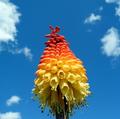
| 05/15/2003 08:38:37 PM |
TRICOLORby mikemtiComment: Interesting. Was this the actual color of the flower? The bottom yellows are a little too light and bright. I think i would have tried a different crop or perhaps a different angle on this. It's good, but something is missing. Good color and contrast on the sky. |
Home -
Challenges -
Community -
League -
Photos -
Cameras -
Lenses -
Learn -
Help -
Terms of Use -
Privacy -
Top ^
DPChallenge, and website content and design, Copyright © 2001-2025 Challenging Technologies, LLC.
All digital photo copyrights belong to the photographers and may not be used without permission.
Current Server Time: 08/02/2025 05:14:36 AM EDT.