| Image |
Comment |
| 11/18/2004 11:38:45 AM |
The witchby Mad-DComment: An interesting image! There is actually some light areas/highlights to the right of the subject that draws the viewer's attention away. Placing that highlight on the subject would have really brought this up a notch. I do like the concept you are working with. |
 Photographer found comment helpful. Photographer found comment helpful. |
| 11/18/2004 11:35:51 AM |
My RacheLoveby theONE77Comment: You have some nice lighting on the face and the catchlights look good in her eyes, but the image is too fuzzy. I'm not sure if this was camera movement or an attempt at soft focus, but I think it takes away from an otherwise good photo. |
| 11/08/2004 09:24:26 AM |
Sylviaby joannsComment: Can you reenter the long dissertation that was lost when you entered, I would love to read it. |
| Photographer found comment helpful. |
| 11/01/2004 12:41:02 AM |
Waterfront Clichéby Dr.ConfuserComment: Yes, the waterfront is done a lot, but rarely this well. The timing was great because the sky had not yet gone fully dark. The window light is crisp and not blown out. The only thing that might be considered a slight negative, is the blur from what I am assuming is a large ship in the harbor (very minor). Excellent execution! |
| Photographer found comment helpful. |
| 11/01/2004 12:19:56 AM |
Daydream Believerby grigrigirlComment: WOW! This was good at first glance, but then I took a minute for a closer look and am truely impressed. The quality of the light from the window is amazing.. it's not blown out yet it has that look. The texture of the veil is remarkable is well. And then part that blew me away, her right eye was lit just perfect. I good gone about this for an entire page, but there are over 400 more images to examine. |
| Photographer found comment helpful. |
| 11/01/2004 12:10:56 AM |
Physicalityby nico_blueComment: I've been doing a lot of toned black and whites lately, so I know how hard it is to get the contrast and exposure just right. This looks fantastic. The back of the hand seems a little fuzzy, but that may be from the conversion to a dpc sized jpeg. I'm not sure what the final score will be, but I'm thinking 7-8 range. |
| Photographer found comment helpful. |
| 11/01/2004 12:00:00 AM |
CRW_3773by NusbaumComment: Originally posted by thatcloudthere:
I really like this...well done! This photo suffers from the same 'white sky' as many of my October photos which is a bit distracting but in some wise provides some contrast to the nice, warm impression of the blurred leaves.
Great addition to the autumn collection! |
I was going to try to burn the sky a bit or blend the blue sky up to the top of the frame, but there was a natural gradient created by the clouds that I just couldn't bring myself to alter. I may come back to it later when the experience of taking the photo isn't so fresh in my head. |
| 10/13/2004 12:29:59 PM |
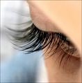
Eye Lashes by JackoComment: Excellent use of DOF and selective focus to highlight the defining feature.
I also like the square crop.
The only thing negative might be the lack of texture in the upper right corner.
I'm thinking 8 for such affective use of photographic tools to highlight the defining feature. |
| Photographer found comment helpful. |
| 09/21/2004 02:57:22 PM |
CRW_2880-01by NusbaumComment: Originally posted by Koriyama:
Very sensual.
Maybe the background is too visible for this mode of photography. |
Thanks for the comment. I'm going to play with levels a bit to see if I can get the background to fade a bit more. |
| 09/10/2004 05:03:00 PM |
nude2.jpgby DrJOnesComment: I think what amazes me most is your ability to manage the skin tones here. I didn't realize until some recent work with a model, but getting the skin tones just right is unbelievably difficult. In this case you manage to do it without the strong shadows going completely black. If I was going to look for something to critique, I would have to say that the electical box and conduit and the left is too sharp relative to the model and background to the right of the model. The strength of this is the light on the model and it is amazing. |
| Photographer found comment helpful. |
Home -
Challenges -
Community -
League -
Photos -
Cameras -
Lenses -
Learn -
Help -
Terms of Use -
Privacy -
Top ^
DPChallenge, and website content and design, Copyright © 2001-2025 Challenging Technologies, LLC.
All digital photo copyrights belong to the photographers and may not be used without permission.
Current Server Time: 08/26/2025 07:17:29 AM EDT.