| Image |
Comment |
| 03/28/2008 06:12:42 PM |
|
 Photographer found comment helpful. Photographer found comment helpful. |
| 03/28/2008 12:52:00 PM |
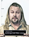
DUDE ! by SJCarterComment: out of 5'10" total height, the model has 16" head. i guess the markings are not to the scale.
i forgot to mention that i like the processing of this shot a lot. also i am guessing that the title came from the movie "big lebowski" because of the resemblance with the character. high points in my books. |
| Photographer found comment helpful. |
| 03/28/2008 11:31:21 AM |
Evil Grinby PhilipDyerComment: the lighting, his expressions, suspect name, charges, and burning name-tag...brilliantly detailed work. |
| Photographer found comment helpful. |
| 03/28/2008 11:27:19 AM |
Cavity Goonby CorySmithComment: you have done brilliant job at make-up and lighting.
although in the absence of visible bad teeth (main feature of the character) this looks more like some alien in any Star Trek episode than cavity goon from Timmy the tooth. i might be considered a super geek to know this off-hand :) to my defense, i am married to a dentist. |
| Photographer found comment helpful. |
| 03/28/2008 11:12:55 AM |
The Irish Mob by hopperComment: details captured in this expertly lit and brilliantly processed portrait are impressive. gotta be on the podium. |
| Photographer found comment helpful. |
| 03/28/2008 11:05:35 AM |
A Master of Disguisesby ColeyComment: the contrast in model's expressions is brilliant i also like the bw conversion in the print. |
| Photographer found comment helpful. |
| 03/28/2008 11:04:03 AM |
Bound and Maskedby jmleliiComment: disturbed but one of the most creative, provocative, thoughtful, moody, and emotional portraits in the challenge. |
| Photographer found comment helpful. |
| 03/26/2008 03:48:59 PM |
Textures and Patternsby LydiaComment: This has nice details and warm colors. the exposure and lighting are good too.
even though this one shows more details in corks, I prefer the ctf version. more background gives meaning to this arrangement of corks. why would one arrange the corks this way? the relationship between background and foreground stops that shot from being just a shot of "neatly arranged corks". the contrast between brick color and white cork color works very nicely too. even the composition looks much more appealing and balanced in that one. |
| Photographer found comment helpful. |
| 03/25/2008 03:16:22 AM |
Coca-Cola Classicby LydiaComment: The only reason I did not vote for this image was...i found the can very "neat and clean". which made it a promo shot instead of a pollution/litter shot for me. then again, i wasn't convinced completely about that feeling either, so did not vote :) |
| Photographer found comment helpful. |
| 03/20/2008 04:32:24 PM |
|
| Photographer found comment helpful. |
Home -
Challenges -
Community -
League -
Photos -
Cameras -
Lenses -
Learn -
Help -
Terms of Use -
Privacy -
Top ^
DPChallenge, and website content and design, Copyright © 2001-2025 Challenging Technologies, LLC.
All digital photo copyrights belong to the photographers and may not be used without permission.
Current Server Time: 08/28/2025 01:53:50 AM EDT.