| Image |
Comment |
| 02/17/2004 02:15:40 AM |
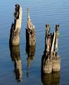
Reflectionsby TerryGeeComment: there are some slight hot spots in your shot, but not drastic enough to detract from a very nice shot. |
| 02/17/2004 02:13:44 AM |
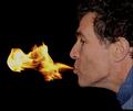
Boy, Was That Spicy!by GolferDDSComment: i like your shot a lot. however, there is some room for improvement in lighting. the lighting on the face is flat. |
 Photographer found comment helpful. Photographer found comment helpful. |
| 02/17/2004 02:11:19 AM |
|
| Photographer found comment helpful. |
| 02/17/2004 02:09:59 AM |
|
| Photographer found comment helpful. |
| 02/17/2004 02:08:46 AM |
Blown Awayby TLL061Comment: there are a number of things that could be done to improve your picture.
lighting - the lighting is not very interesting and is casting in the same direction of the shot, which creates a flat looking image. i would try and experiment with different lighting directions.
background - the background could be improved by moving the figure further away from the cloth drop. there is nothing really wrong with the cloth, but if the figure was further from it there wouldn't be harsh black shadows casting on the cloth.
crop and perspective - i would suggest getting closer to your subject and trying to pick out what it is that interests you. once you find what it is, you can get closer on it and leave out all the other parts. also along with getting closer you could try different angles to shoot from that would create unusual views, which would in turn interest the viewer.
working on these things would improve any picture from looking like you are trying to sell something, to something more artistic. |
| Photographer found comment helpful. |
| 02/17/2004 01:54:35 AM |
H2O at 1/1000thby scrum8Comment: one of the brave few who went the opposite way and stopped the water. nice job. |
| Photographer found comment helpful. |
| 02/17/2004 01:51:24 AM |
Elemental Oppositionby theodor38Comment: one of the few times when a wild border makes some sorta sence. it will be interesting to see how this was done. |
| Photographer found comment helpful. |
| 02/17/2004 01:48:05 AM |
3S - Sand, Sea and Skyby oksamitComment: the hue seems off. everything seems slightly purple. even the brown and green have hints of purple.
on a side note. from a distance it looks like a flag of an unknown country with the three sections being equal. almost like three stripes. just a random thought. |
| Photographer found comment helpful. |
| 02/17/2004 01:43:05 AM |
|
| Photographer found comment helpful. |
| 02/17/2004 01:41:53 AM |
|
Home -
Challenges -
Community -
League -
Photos -
Cameras -
Lenses -
Learn -
Help -
Terms of Use -
Privacy -
Top ^
DPChallenge, and website content and design, Copyright © 2001-2025 Challenging Technologies, LLC.
All digital photo copyrights belong to the photographers and may not be used without permission.
Current Server Time: 08/15/2025 07:52:04 PM EDT.