| Image |
Comment |
| 05/05/2003 11:55:36 PM |
|
 Photographer found comment helpful. Photographer found comment helpful. |
| 05/05/2003 11:38:37 PM |
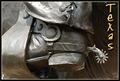
Texasby DennisFComment: Like the image and it reminds me of the Don't Mess with Texas motto (which is such a great motto). The Texas text fits in well, too. My problem is that it so very much the representation of a work of art, although you cropped it well to its essence. 7 |
| 05/05/2003 11:32:44 PM |
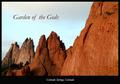
Garden of the Godsby K-RobComment: Nice image, nice title, nice placement within the image. My only problem with this image is that i would have liked to see the first rock on the right more in focus (which seems to be on the second rock). That first rock is so blurred that i have some trouble relating to it. 8 |
| Photographer found comment helpful. |
| 05/05/2003 11:19:05 PM |
Manchester so much to answer forby PaulkComment: Really like the originality of this shot. Have never been to Manchester but, judgng from postcard, you make it look a lot more interesting than i ever could imagine. Strong composition, great colors, the text is perfect - bold yet not interfering and matching the boldness of the architecture. Minor nitpick: in the title, shouldn't there be a comma or a dash after Manchester? This is the type of postcard friends would send to me because they know i don't care much for the run of the mill typical postcard. 10 |
| Photographer found comment helpful. |
| 05/05/2003 11:11:56 PM |
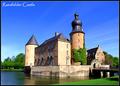
Raesfelder Castleby kiwinessComment: Guten Abend. This is postcard-perfect. Nice how one's eye is led from the grass onto the bridge, right into castle gate and castle. Colors are great (for my taste, i might have knocked down the saturation of the sky just a tad). The only thing that bothers me a little is the shadow on the grass but that might be from a permanent object. 9 |
| Photographer found comment helpful. |
| 05/05/2003 11:07:29 PM |
In a New York Momentby dimitriiComment: Great picture! This sums up NY with all its energy much better to me than any picture of a monument (so often seen already). Colors are great, too. 10 |
| Photographer found comment helpful. |
| 05/05/2003 10:59:09 PM |
Dallas, Texasby goodtempoComment: Very strong design here; the thumbnail just popped at me. What's the red notice for? Did someone think you cut & pasted in the background? :) Think you did that deliberately with the polarizer to harmonize the image. Man, this is strong in design! 8 |
| 05/05/2003 10:50:21 PM |
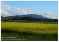
Geneva countrysideby jjbeguinComment: Like the simplicity and 'quiet' of this shot with the overriding blues and yellows (just put a red object in that field and you've got it licked for the primary colors challenge as well :) My only beef is with the dark area in the front. For my taste, the pic would have been stronger if it had started higher with the brighter yellows. Nice font as well. 7 |
| Photographer found comment helpful. |
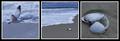
| 05/05/2003 01:06:01 AM |
Ebb and Flowby KarenBComment: Karen, had given you an 8 but no time to comment. I pretty much guessed you did this. I really like the mood of this presentation - i can see/sense you spend a lot of time on the beach. Lovely colors, very tranquil. This image also reminded me of another one of yours, that i liked a lot, the one in Negative Space, Coming and Going? |
| Photographer found comment helpful. |
| 05/05/2003 01:02:55 AM |
Jeni's Etudeby sagestudioComment: Marianne, had given you an 8 but had no time to comment. Like how this presentation give a good sense of what is must feel like to play the harp. The framing with the yellow harp details is rather bold, but it works and very effective in telling the 'story'. Good job! |
| Photographer found comment helpful. |
Home -
Challenges -
Community -
League -
Photos -
Cameras -
Lenses -
Learn -
Help -
Terms of Use -
Privacy -
Top ^
DPChallenge, and website content and design, Copyright © 2001-2025 Challenging Technologies, LLC.
All digital photo copyrights belong to the photographers and may not be used without permission.
Current Server Time: 08/20/2025 04:44:52 PM EDT.