| Author | Thread |
|
|
09/20/2003 10:34:37 PM |
|
nice detail, good color....great texture.... |
|
Comments Made During the Challenge  |
|
|
05/11/2003 10:57:41 AM |
|
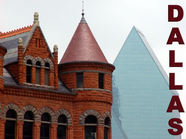
Not one's stereotypical view of that city! |
|
|
|
05/09/2003 04:27:51 PM |
|
very neat idea with an older style building next to a very modern one! says a lot about dallas! :) Would have been nicer if the sky co-operated and gave you some blue! Did you try using a polarizing filter or something in post production? |
|
 Photographer found comment helpful. Photographer found comment helpful. |
|
|
05/09/2003 03:28:14 PM |
|
The white background and flat light work against a good composition |
|
|
|
05/09/2003 04:33:33 AM |
|
Awesome effect! The building really look as if they have been pasted into the pic, you have got them outlined so sharp against the background, good stuff! Imagine the effect you could have created had the sky been a deep blue color? Wow! |
|
| Photographer found comment helpful. |
|
|
05/08/2003 05:22:47 PM |
|
Nice composition and good shot. |
|
|
|
05/08/2003 12:14:08 PM |
|
Wow, weird. It's a cool photo, but you must have done some interesting things to get this shot. I like the contrast of the colors, warm against cool. Strange but intriguing. |
|
| Photographer found comment helpful. |
|
|
05/07/2003 03:35:52 PM |
|
I like the contrast between old and new here. I'm not sure I like the way it looks kind of one dimensional. Like cutouts. I also don't like the white bg too much. I love this old building. Really beautiful! I think a less chunky font would be more attractive. |
|
| Photographer found comment helpful. |
|
|
05/07/2003 03:23:44 PM |
|
The cropping is claustrophobic, and I really can't see this on a post card. Nice color, nice focus, though. |
|
|
|
05/06/2003 10:36:29 AM |
|
I love the old/new juxtaposition! Personally I wish the sky were bluer (weather is so fickle!) and the light brighter. Also, I wonder if placing the word "Dallas" so that it somehow connects the old and the new building would be more effective? |
|
|
|
05/06/2003 05:16:14 AM |
|
Great new and old shot, however I wish I could get a better sense of the perspective and size differences of the two buildings, since they are so far apart. |
|
|
|
05/05/2003 10:59:09 PM |
|
Very strong design here; the thumbnail just popped at me. What's the red notice for? Did someone think you cut & pasted in the background? :) Think you did that deliberately with the polarizer to harmonize the image. Man, this is strong in design! 8 |
|
|
|
05/05/2003 07:19:35 PM |
|
Marvelous composition! The echo of the building shapes not only is cool, it also gives a hint as to what Dallas is all about--both historical and modern interest. I want to go to Dallas now. If I come, can I sleep on your floor if I bring my own sleeping bag? |
|
|
|
05/05/2003 06:46:09 PM |
|
Must have been cloudy because the sky is almost completly white. |
|
|
|
05/05/2003 10:58:15 AM |
|
Kool shot....the old/new look of Dallas. Too bad the sky is so flat. Usually it's so sunny there with blue sky! |
|
|
|
05/05/2003 12:11:53 AM |
|
home sweet home! :o) well at least it next door to sweet ft worth :o) that your shot seeker? the old courthouse looks nicely exposed.... good color... but the sky is washed... always tough to work with... nice compostition though |
|
Home -
Challenges -
Community -
League -
Photos -
Cameras -
Lenses -
Learn -
Help -
Terms of Use -
Privacy -
Top ^
DPChallenge, and website content and design, Copyright © 2001-2026 Challenging Technologies, LLC.
All digital photo copyrights belong to the photographers and may not be used without permission.
Current Server Time: 06/28/2026 10:32:48 PM EDT.