| Image |
Comment |
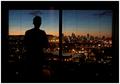
| 07/30/2005 04:25:52 PM |
~ Bedroom with a View ~by doctornickComment: This is a great idea. I think it could be more dramatic if you actually crop it in tighter to eliminate the edges of the window. The only thing I don't like about it past that is the space between the windows, but nothing can be done about that. The blinds are sufficient to show that you are actually looking out a window, but the subject could place hands up on the glass as well to emphasize. Good work. |
 Photographer found comment helpful. Photographer found comment helpful. |
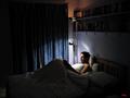
| 07/30/2005 04:23:03 PM |
Insomniaby tazzaComment: I like this quite a bit, the lighting and idea are great. I think you should crop this tighter to place the person in the lower left corner of the frame and crop the top down to just above the lamp. eliminating the edges of the curtain and minimizing the illuminated corner above the lamp or even eliminating the tall lamp all together. Good detail. |
| Photographer found comment helpful. |
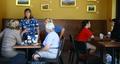
| 07/30/2005 04:18:51 PM |
Lurking on their chatby CEJComment: The color is very nice. The angle seems all wrong. Basically you have two chats going on here and you have split the veiwers interest between the two. The better photo would have been focused on the left group (since one person is facing the camera. Another distraction is the cut in half photos on the background wall. If this couldn't be avoided, It should be blurred. I think you have an interesting photojournalistic eye here, but the framing and angle need work. |
| Photographer found comment helpful. |
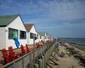
| 07/30/2005 04:15:59 PM |
Rooms With a Viewby RayEthierComment: Interesting. great color. Nice comp. the only thing I dont like is the focal point becomes the bathing suit on the line. The bathing suit is fine, but It would have been better turned around so that you don't see the inside since it is where your eye rests. Sometimes these things are not in our control. Good job overall. |
| Photographer found comment helpful. |
| 07/30/2005 04:13:21 PM |
Extra-Super-Relaxed Fitby typologicComment: I like the treatment here. The lighting is interesting. great texture and detail. I am not sure about the placement of the subject's hand. it looks strained. A thumb through a belt loop pulling to the side with a more relaxed stance might have appeared more natural. Good job though. |
| Photographer found comment helpful. |
| 07/30/2005 04:11:27 PM |
Space-A-Plentyby barbaraanneComment: This is nice and interesting. I think I would have liked it better if the subject were in the right third of the frame and rotated for more of a profile, but this is nice as is. |
| Photographer found comment helpful. |
| 07/30/2005 04:09:22 PM |
Office Perspectiveby banmornComment: Nice contrast, color, lines. No real focal point. It would be stronger with a single point of interest. |
| Photographer found comment helpful. |
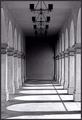
| 07/25/2005 12:40:24 AM |
Hall of Shadowsby aboutimageComment: This has great potential. What a great spot. I am partial to portraiture, so I may be a bit biased, but I think the thing missing here is a solitary figure of a person. What an excellent background for fashion photography or, as mentioned previously, a wedding shot. Just lovely. |
| Photographer found comment helpful. |
| 07/25/2005 12:27:20 AM |
|
| Photographer found comment helpful. |
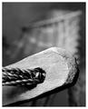
| 07/25/2005 12:26:05 AM |
Roped and Twinedby armelleComment: This is a great composition with nice detail. The contrast could be bumped up just a tad for more true blacks and whites, but some thought went into this one. I could see this being a successful stock image. It could be associated with loneliness, emptiness, winter, etc. Many uses. |
| Photographer found comment helpful. |
Home -
Challenges -
Community -
League -
Photos -
Cameras -
Lenses -
Learn -
Help -
Terms of Use -
Privacy -
Top ^
DPChallenge, and website content and design, Copyright © 2001-2025 Challenging Technologies, LLC.
All digital photo copyrights belong to the photographers and may not be used without permission.
Current Server Time: 08/27/2025 06:37:42 PM EDT.