|
|
|
Showing 201 - 210 of ~273 |
| Image |
Comment |
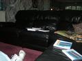
| 09/24/2002 03:00:00 PM | Where we live...by assmanComment: In my humble personal opinion, I found no interesting or attracting spot in this image. The angle is quite uninspiring (not high, not low, not from one corner, not from the center...). I think you may have used a flash. I would never recommend the use of a non professional flash, and never to illuminate a black surface as the sofa. The resulting image is always flat, untextured and cheaply contrasted. |
| 09/27/2002 10:02:00 AM | |
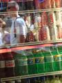
| 09/24/2002 02:16:00 PM | Inside Outby CumbiaComment: In my humble personal opinion I think this image is not inspiring. It's neither in nor out of the store, and it ends up telling me that the main character here is the soft drinks. Soft drinks cannot be your corner of the world. Technically it lacks focus. What item is the central point of attention: the cans, the bottles, the cooler shelves, or the reflection of the people on the store�s window? |
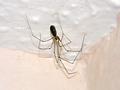
| 09/26/2002 10:56:00 AM | Lurking in my Corner...by PunkMageComment: In my humble opinion, it's too white around the subject, and the shadow from the spider could have been sharper, on focus and intensely dark, which would provide a very interesting result. It is basically a question of ilumination technique, which is the best kept secret of photography. |
| 09/26/2002 10:36:00 AM | 1 am. need sleep.by HecubusComment: In my humble opinion, this was a pretty interesting angle, and the idea meets very well the challenge, but the deficiencies en the photographic technique and the resulting quality of the image is very bad. It seems to me the camera's capabilities are not helping you too much |
| 09/26/2002 10:52:00 AM | A Corner of the Worldby naeilComment: The result here is obviously too much out of focus. You have five planes from the front to the background. The ilumination is dull and does not help you with this, nor does the speed and shutter relation. |
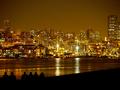
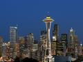
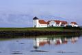
| 09/27/2002 09:45:00 AM | Postcards 101: Assignment Seattle by chrisabComment: This looks like a hiper-reality drawing. The needle looks unreal. The background looks like a perfectly even backdrop (blue screen) in a studio. The buildings are so perfect they look like an escenographic model, and the ilumination feels like a movie set. I would be pleased to see this stupendous image winning a ribbon. I love it. |  Photographer found comment helpful. Photographer found comment helpful. |
| 09/26/2002 10:45:00 AM | Jesmol' sami?by djenanbacvicComment: In my humble opinion, it could be the moon, or a ball of concrete. Too flat, dull light. I believe you chose a subject that is out of the reach of your camera's capabilities. |
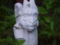
| 09/26/2002 09:39:00 AM | Garden Bluesby nicowensComment: In my humble opinion, this image is not sharp at all, and the subject, with a dull light, is not atrative in any sense. The lack of a primary source of light makes it look flat, with no contrast and definition. The contrast resulting from this white paint against the greenery is not aesthetic, so the composition is feeble; placing the subject in the center, and cropping it's upper edge is part of the problem. |
| 09/27/2002 10:01:00 AM | |
|
Showing 201 - 210 of ~273 |
Home -
Challenges -
Community -
League -
Photos -
Cameras -
Lenses -
Learn -
Help -
Terms of Use -
Privacy -
Top ^
DPChallenge, and website content and design, Copyright © 2001-2025 Challenging Technologies, LLC.
All digital photo copyrights belong to the photographers and may not be used without permission.
Current Server Time: 08/23/2025 02:40:16 PM EDT.
|