|
|
|
Showing 191 - 200 of ~273 |
| Image |
Comment |
| 09/24/2002 01:51:00 PM | Corner? My whole world...by myqylComment: In my humble personal opinion, the focus for this image needed to be especially sharp. The light is too dull. It is nice to be honest and offer your true feelings, but instead of a very common family portrait, I would have prepared a scene of the family interacting with something else, surrounded by your geography (even the garden) and an appropriate light that would provide the warmth of the parents and the obvious beauty of the child. |  Photographer found comment helpful. Photographer found comment helpful. |
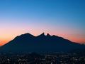
| 09/30/2002 08:21:00 PM | A View Of "La Huasteca" Mountains From School by amonteforteComment: I am very honored with your comments and congratulations. The result was specially satisfying for me since that week I spent morning after morning dropping my kids at school, and staying in the parking lot chasing an elusive sun light that I was sure would have to hit that mountain sooner or later, but of course I had to have clouds in my morning sky, and those same clouds were covering my sunlight. Finally, the last day, there was a clearing between the clouds, a 30 seconds chance at it, and I was right there, waiting for it. I was noticed by everyone in school �the strange father who stays every morning with a tripod and a camera, looking at the distance�� Thanks a lot to all those great photographers who gave this week to me, when so many of them were equally deserving. aldo |
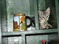
| 09/26/2002 10:29:00 AM | jezebel's cornerby johnny_justjohnnyComment: In my personal opinion, you should keep away from the use of flashes to iluminate, unless you have a professional equipment to control the inevitable "burning" effect on the reflecting surfaces of your subject. I would have cropped out the unatractive looking bottle caps in the bottom, and I found no aesthetic reason for the unlevel angle of the image. The kitten is very cute anyway... |
| 09/26/2002 10:24:00 AM | Global Americaby YomiComment: In my humble opinion, your theme was pretty challenging technically, and I think many aspects need to be reviewed: the main subject is not leveled. Perhaps cropping part of it would make a more interesting composition, instead of cutting out right at the edges of it. The background would need to be preferable a solid color, I would use black; I don´t think you need more textures to come into play. The reflections from the windows and curtains are not desirable, they contaminate the inside of the glass ball. You would need to get rid of all light around the area, and concentrate on the main subject one source of ilumination, in order to avoid the rest of the room to be reflected on the glass ball's surface, and crop out from the composition the inevitable reflection on the glass surface from the light source. |
| 09/27/2002 10:00:00 AM | My Whole World in a Cornerby lmhrComment: I have been coming back to this image again and again through the week. Real and honest simple things are very precious. At the end of the story, after going through 243 other photographs, I recognized the talent behing this picture, and the level of emotion conveyed. This is, as simple as it is, simply brilliant, and my final choice to win this race. BTW, I also think it's technically faultless and the chosen tittle is excellent. |
| 09/26/2002 10:14:00 AM | And Stay Out!by shedonistComment: In my humble personal opinion, even if you were able to obtain the sense of a B&W background, in a color picture, your suject is unatractive and uselessly agresive. The extreme white from the sign, contrasted with the intense red of the letters makes it look unfocused. |
| 09/24/2002 01:42:00 PM | Flowers in the Dining Roomby mscott821Comment: In my humble opinion, there are far too many subjects in front of the mirror and around it. The light from the left does not provide a desirable contrast and feel, because it is too intense and it "burned" the objects. The composition is unbalanced and too crammed. The title is not very important, but this image, as cropped, does not relate me to a dining room. All of the objects got partially cropped out: the jar, pine cones, lamp, flower vase, mirror and picture frames. |
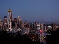
| 09/27/2002 09:48:00 AM | Seattleby joannsComment: Seattle is a picture perfect city from a distance by itself. What I like most about your angle choice is the inclusion of the mouintain in the far background. | | Photographer found comment helpful. |
| 09/26/2002 10:03:00 AM | Our Sporting Heroesby GinaRothfelsComment: In my personal opinion, this composition and theme required the background to be sharply in focus. The light is too dull which makes the colors very sad. A much more intense light source would be needed, with the adequate background ilumination to remove unwanted shadows from the figures |
| 09/27/2002 10:07:00 AM | Good Morning Monterrey!by jenaromComment: I know who you are, and I have noticed that your work has been improving consistently every week. The chosen tittle is very good, for an excellent shot of our city's natural landmark. Congratulations. You clearly deserve a better camera. |
|
Showing 191 - 200 of ~273 |
Home -
Challenges -
Community -
League -
Photos -
Cameras -
Lenses -
Learn -
Help -
Terms of Use -
Privacy -
Top ^
DPChallenge, and website content and design, Copyright © 2001-2025 Challenging Technologies, LLC.
All digital photo copyrights belong to the photographers and may not be used without permission.
Current Server Time: 08/23/2025 01:35:38 AM EDT.
|