| Image |
Comment |
| 10/25/2004 09:10:53 AM |
|
 Photographer found comment helpful. Photographer found comment helpful. |
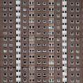
| 10/25/2004 07:45:01 AM |
Fallby PoobaComment: It would be much better if it was bigger. Still I like the shot |
| Photographer found comment helpful. |
| 10/25/2004 07:43:42 AM |
|
| Photographer found comment helpful. |
| 10/25/2004 07:26:48 AM |
Thursty?by vasilkovayaComment: Hey, you took my idea :)
Only made it way better. Great shot. I love the clarity. Nice.
9 |
| Photographer found comment helpful. |
| 10/25/2004 07:25:53 AM |
Window Linesby kevrobertsonComment: So sad, I can't look. Yet it reminds me of my childchood.
Bliliant idea. Quality not as high, but still i have to give it an 8 |
| Photographer found comment helpful. |
| 10/25/2004 07:24:40 AM |
|
| Photographer found comment helpful. |
| 10/25/2004 07:24:08 AM |
|
| 10/25/2004 07:21:29 AM |
Rice Harvestby KoriyamaComment: it's out of focus. Or should i say - moved. Using a tripod would help a lot.
I don't think the 'sepia' effect is needed here. desaturation yes, but monochroma not.
Still the line is much better that most I've seen so far. |
| Photographer found comment helpful. |
| 10/25/2004 07:18:27 AM |
Convergent Towerby eojedaaComment: First thing - it's tilted. Second, I see no IMPLIED lines here. They're all solid to me. |
| 10/25/2004 07:11:15 AM |
Lines in the Ceilingby ssodellComment: This is a joke, right? First of all if it's a ceiling, why does it look like a wall (funny rotation - I know, but it doesn't fit). Second and most of all I believe you there are lines on your ceiling, but they would have to be a bit more visible for me to score it any high. |
| Photographer found comment helpful. |
Home -
Challenges -
Community -
League -
Photos -
Cameras -
Lenses -
Learn -
Help -
Terms of Use -
Privacy -
Top ^
DPChallenge, and website content and design, Copyright © 2001-2025 Challenging Technologies, LLC.
All digital photo copyrights belong to the photographers and may not be used without permission.
Current Server Time: 08/18/2025 08:46:29 AM EDT.