| Image |
Comment |
| 10/06/2004 04:02:32 PM |
Hanging Aroundby scarabanzaComment: Very creative. I think it would have looked better if the background had been very white or a solid color. But that's just an opinion. |
 Photographer found comment helpful. Photographer found comment helpful. |
| 10/06/2004 12:17:42 PM |
|
| Photographer found comment helpful. |
| 10/06/2004 12:17:01 PM |
|
| 10/06/2004 12:14:44 PM |
Um pah pahby photomComment: Just an opinion here.... I think it woulld be better to cut it just above the man's head so the opening is sitting on one of the thirds. That's what I thought it was at first glance, and was disappointed when I scrolled down to see the man's face. If you wanted his face in the photo, then I would crop off the top so the opening would again be sitting on a third. But, hey, I've never won a ribbon, so who am I to give advice ;-) |
| Photographer found comment helpful. |
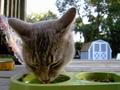
| 10/06/2004 12:07:24 PM |
Big Headby incubusComment: Two suggestions: use a solid background and more light on the cat's face. For what it's worth ;-) |
| Photographer found comment helpful. |
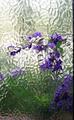
| 10/06/2004 12:01:09 PM |
A Bit of a Paneby biggood53Comment: Beautiful effect. The only suggestion for improvement is to crop the line off the right side. |
| Photographer found comment helpful. |
| 10/06/2004 11:25:03 AM |
He Won't Walk Without Itby Adam520Comment: May I suggest a solid white or black background and a better focus on the part that is the subject of the photo. |
| 10/06/2004 10:54:42 AM |
a boy wathing somthing from the glassby AsadComment: One suggestion for improving the photo would be to crop the overexposed are on the right. I also think the boy's face needed some more light. Just my opinion :) |
| Photographer found comment helpful. |
| 10/01/2004 06:31:26 PM |
Roses with Blurby digistouneComment: WoW! I love it! The white on white and the composition. And, of course, the soft focus ;-) |
| Photographer found comment helpful. |
| 09/30/2004 03:56:59 PM |
While I was out...by awpollardComment: I loved your idea. It is well focused, very creative and I like the tile background. But there seems to be some kind of haze over the picture -- it lacks clarity. I don't know enough to tell you what caused it, but can definitely see it -- even on the thumbnails. (I checked on 3 different monitors.) I didn't rate it low, but did rate a couple of others higher because of that. Still, it really made me chuckle! |
| Photographer found comment helpful. |
Home -
Challenges -
Community -
League -
Photos -
Cameras -
Lenses -
Learn -
Help -
Terms of Use -
Privacy -
Top ^
DPChallenge, and website content and design, Copyright © 2001-2025 Challenging Technologies, LLC.
All digital photo copyrights belong to the photographers and may not be used without permission.
Current Server Time: 08/25/2025 08:24:00 PM EDT.