| Author | Thread |
Comments Made During the Challenge  |
|
|
10/05/2004 07:30:39 PM |
|
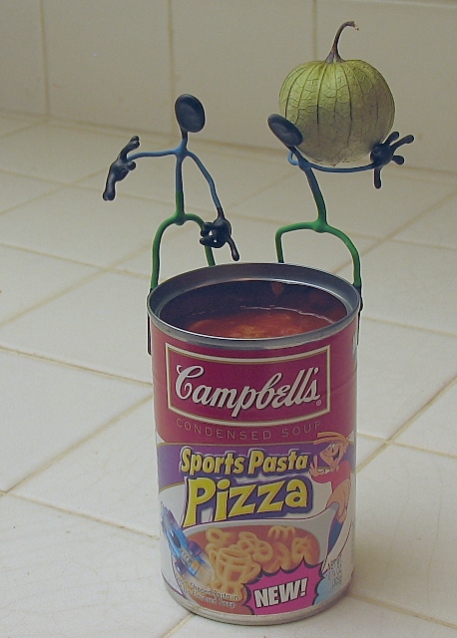
Cute but it has a strange cast to it, I can't quite figure out what it is. |
|
 Photographer found comment helpful. Photographer found comment helpful. |
|
|
10/04/2004 11:33:44 PM |
A cute idea! I would have scored this much higher if the photo didn't look so washed out. This might have been a good photo to shoot with light coming through the white shades of a kitchen window to add some soft, natural light?
|
|
| Photographer found comment helpful. |
|
|
10/04/2004 07:23:32 PM |
|
Great setup. Not great contrast though. It feels like the room is full of smoke or your lens is fogged up. I like the way the action figures feel in motion and alive though. |
|
| Photographer found comment helpful. |
|
|
10/04/2004 05:27:32 PM |
|
| Photographer found comment helpful. |
|
|
10/03/2004 04:44:33 PM |
|
I think it would be better with a different background. |
|
| Photographer found comment helpful. |
|
|
10/02/2004 02:25:54 PM |
|
Interesting soft light...and idea is nice too. Just wall behind going away makes compozition out of place. |
|
| Photographer found comment helpful. |
|
|
09/30/2004 04:50:09 PM |
|
Very funny! Great composition. Sharp focus. Like the lighting even if a tad light. How did you do this photo no shadows in it? |
|
| Photographer found comment helpful. |
|
|
09/30/2004 03:56:59 PM |
|
I loved your idea. It is well focused, very creative and I like the tile background. But there seems to be some kind of haze over the picture -- it lacks clarity. I don't know enough to tell you what caused it, but can definitely see it -- even on the thumbnails. (I checked on 3 different monitors.) I didn't rate it low, but did rate a couple of others higher because of that. Still, it really made me chuckle! |
|
| Photographer found comment helpful. |
|
|
09/30/2004 11:46:58 AM |
|
i'm not sure what's going on here... |
|
|
|
09/29/2004 11:48:25 AM |
|
I like it. It seems hazy or washed out though. Perhaps a contrast or saturation boost. |
|
| Photographer found comment helpful. |
|
|
09/29/2004 09:26:20 AM |
|
Great composition, too bad about the lighting |
|
| Photographer found comment helpful. |
|
|
09/29/2004 06:39:02 AM |
|
I love the stick figure guys! Picture looks a little washed-out, maybe more saturation on the color would have helped. |
|
| Photographer found comment helpful. |
|
|
09/29/2004 02:58:30 AM |
|
Nice and creative. Looks like the image could use more saturation and contrast...looks a bit "milky"... |
|
| Photographer found comment helpful. |
|
|
09/29/2004 12:39:15 AM |
Cool idea
would of loved it more if more brighter
I need to get my self some lolly servents as well :)
[10] for creativity |
|
| Photographer found comment helpful. |
Home -
Challenges -
Community -
League -
Photos -
Cameras -
Lenses -
Learn -
Help -
Terms of Use -
Privacy -
Top ^
DPChallenge, and website content and design, Copyright © 2001-2026 Challenging Technologies, LLC.
All digital photo copyrights belong to the photographers and may not be used without permission.
Current Server Time: 06/29/2026 03:52:21 AM EDT.