| Image |
Comment |
| 01/25/2006 01:47:53 AM |
The Tribute - Manny Librodoby sir_bazzComment: the grayscale here is exqusite the childs expression isn't as gripping as librodo's subjects are, and that is IMO the only fualt with the image. i think librodo has a way of drawing out that extra spical expression that inner child. of even a child be it sad or happy he can grab it with his shutter, this comes close to him, but eyes arn't everything. still in all fareness this is better than most of the images in the challenge that i have viewed so far. and so u get one of the highest votes so far. lol, funny how that works. |
 Photographer found comment helpful. Photographer found comment helpful. |
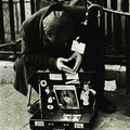
| 01/25/2006 01:43:22 AM |
Peter-Joel Witkin's silver toothpickby toffleComment: in this case it is all about the light, his origional image is so contrasty and fanciful in its crometone state it really grabs the viewer. with your image which is both blurry and poorly lit/composed. u do not see enough of the figure, u do not have a story book sence of lighting and contrast, and the image is in color, not a hug thing, but definatly missing all the points of what makes his image so attractive and intriguing. also u have a white boarder on only 2 sides of the image the right & the bottom. not exactly taboo. |
| Photographer found comment helpful. |
| 01/25/2006 01:37:16 AM |
The Dancer - Imogen Cunninghamby angela_packardComment: this image has a nice grayscale 2 in something Imogen also has in most all her images but it lacks a real draw. nothing grabs u in it the way her images draw u in, i think to a large degree this is beacuse of the subjects pose and the framing of the shot itself. also there is no real sencd of connection with the viewer no common ground to meet on, in your image the viewer must ingadge the image or not look at all, in her images the image will ingadge the viewer drawing u in with a common ground. most offten a pose which instantly fascinates the viewer with its form and stance to the camera.
this image lacks that quolity and in the case of Imogen (i feel) that is core to the image. GL |
| Photographer found comment helpful. |
| 01/25/2006 01:28:33 AM |
|
| Photographer found comment helpful. |
| 01/25/2006 01:26:35 AM |
Anne Geddesby sigurdjonComment: i don'twant to be harch or have this come across as a put down, so i will comment lightly for now and if u would like a more fully difined comment PM me and i will add all my thoughts, but for now.
this needs alot of refinement before it can be concedered a Anne Geedes copy in any real way. her images are not just a cute baby, they also have some basic photographic points which this image is missing in gross amounts.
keep at it and someday maybe u will be able to really fool us all, but with this image u need to study much more before u get there. |
| Photographer found comment helpful. |
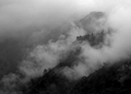
| 01/25/2006 01:16:50 AM |
Cold Mountain (Ansal Adams)by fiveriversComment: if only there were more white and even a pure white in this image it would be steller, and new look at his style with a photograph which is clearly not over done as far as mymics go.
i would hit the fog/clouds with the dog tool and then with the burn to really exagerate the light and shadow. it would make this a really dynamic shot using his rules but keeping it yours...
as is nicly done. (the gamma on my mac maybe the prob. it is mac gamma and if this is a PC then your whites are my grays i will take that into account) good luck |
| Photographer found comment helpful. |
| 01/25/2006 01:13:26 AM |
Tribute to Alfred Stieglitz Empire Through the Treesby jlshutterbugComment: to really mymic his style the image u have should be in a form of sepia or B&W, or a crome tone.
also as far as composition goes u fall far from his images and his eye. he is 1 of the great greats in photography and as far as the framing goes he would not have taken a shot in such a record like form, something more powerfull from lower down and facing up through the trees to make the city loom above the viewer. he worked alot with drastic light and unfortinutly we can control the sun but the closest we can come is buy abserving the stiuation and looking for the best light and shadow, something Stieglitz if famous for. this is a great start but really has along way before it hits his kind of style, and imagery. GL |
| Photographer found comment helpful. |
| 01/25/2006 01:07:18 AM |
Iris a Tribute to Robert Mapplethorpeby AdrienneGCComment: it strikes me that to really hit close to his style this image would need to be in a sepia or cyanotype (or douitone blue sepia), and B&W of corse. color just wasn't his prime focus. also composition wise he uses alot of leading lines with his flower shots the tem draws u in from the conor or an odd angle of view and the flower hits dead center, that kinda thing. u missed the mark here, IMHO. |
| 01/25/2006 01:00:25 AM |
|
| Photographer found comment helpful. |
| 01/25/2006 12:52:11 AM |
Alstroemeria & Rock (Katinka Matson)by tcmartinComment: very nice over all, u could've possibly matched the color tones by going a little more pastell and fading the edages off into the black backround would have really assumed her entire style.. but as far as 1 shot, it could've been taken by her. nicly done |
| Photographer found comment helpful. |
Home -
Challenges -
Community -
League -
Photos -
Cameras -
Lenses -
Learn -
Help -
Terms of Use -
Privacy -
Top ^
DPChallenge, and website content and design, Copyright © 2001-2025 Challenging Technologies, LLC.
All digital photo copyrights belong to the photographers and may not be used without permission.
Current Server Time: 06/25/2025 07:19:15 AM EDT.