| Image |
Comment |
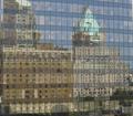
| 01/27/2005 04:28:15 PM |
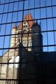
Old and New Buildingsby SimonkasprzakComment: Most building reflection pictures I see don't show the inside of the reflective building, like this one does... in this case, it serves to make the reflected buildings more "ghostly," given them an even older feel. |
 Photographer found comment helpful. Photographer found comment helpful. |
| 01/27/2005 04:23:41 PM |
Solid Power versus Transparent Powerby PeterCComment: Those triangles on the top of the glass building look like an evil jack-o-lantern. :) Was there an angle that could have removed that building in-between and the one at the lower-right? |
| Photographer found comment helpful. |
| 01/27/2005 04:20:10 PM |
|
| Photographer found comment helpful. |
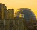
| 01/27/2005 04:19:06 PM |
The Castle and The Skyscraperby redmoonComment: The gherkin! I've never been to London, but it seems like a great place to contrast old and new... I think if you had gotten a little lower, you could have removed that distracting blue light just left of center above the castle. Too bad the castle wasn't lit with torches instead of electric lights. :) |
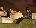
| 01/27/2005 04:14:56 PM |
The Winds of Timeby devboboComment: I like the subtlety of the windmills in the picture. It may just be my monitor, but the tree takes something away from the picture (in my opinion) because it obscures the building too much. The darkness gives this great atmosphere. |
| Photographer found comment helpful. |
| 01/27/2005 04:10:10 PM |
Ageless Reflectionby breckinshireComment: Good thing I don't stlil live in Boston, or we both would have submitted this photo. :) I like the shadows... (that glare in the bottom left and the two lights inside the Hancock must have been frustrating). |
| Photographer found comment helpful. |
| 01/27/2005 04:05:44 PM |
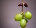
Ripeness Descendingby jessfrolioComment: Did you speed up the ripening process on the top grapes, or is there some other photographic trick here? Very creative... |
| Photographer found comment helpful. |
| 01/27/2005 12:39:37 PM |
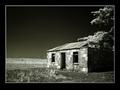
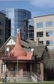
The New Builds Around the Oldby briphotoComment: I know there's not much you can do about it, but the shadow of the tree on the front of the house and the tree on the right are distracting... For the tree on the right, perhaps taking the picture from an angle that included the whole tree would work. But I like the way the shot is set up here anyway... |
| Photographer found comment helpful. |
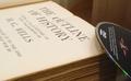
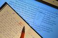
| 01/27/2005 12:33:06 PM |
The State of the Artby The_ItinerantComment: I like the idea here (especially the circles on the page trying to get the ink to flow). Having the book right up against the monitor like that, though, seems a little off to me (maybe it's the shadow on the monitor?) Perhaps there is a slightly different angle at which the book could be held. Part of me also thinks the top part of the monitor shouldn't be included, but then you get to see the book binding, so why not the "monitor binding"? |
| Photographer found comment helpful. |
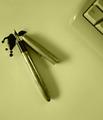
| 01/27/2005 12:28:22 PM |
Last drop ...by andr00Comment: At first I thought you should show more of the keyboard, but then I realized that you knew what you were doing. :) (The keyboard would have dominated the pen if more of it was shown). I suppose there could be a hidden (or intentional?) meaning in choosing to show only the "ctrl" key--contrasting the modern "control" or rigidity vs. the "messiness" of prior times. Or maybe I'm reading too much into it... |
| Photographer found comment helpful. |
Home -
Challenges -
Community -
League -
Photos -
Cameras -
Lenses -
Learn -
Help -
Terms of Use -
Privacy -
Top ^
DPChallenge, and website content and design, Copyright © 2001-2025 Challenging Technologies, LLC.
All digital photo copyrights belong to the photographers and may not be used without permission.
Current Server Time: 08/03/2025 09:34:50 AM EDT.