| Image |
Comment |
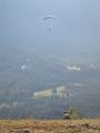
| 12/02/2002 04:01:00 PM |
Hey, Come Back!by lamentComment: I like this picture! It honestly would have lost alot of its value had that dog not been there. IMO your composition would have been a little stronger had the paraglider taken up a little bit more of the frame.. been just a little bit bigger.. if you didn't have that haze there he'd get lost in the commotion in the background. You really want to make the subject pop out from everything else. Having said that if the person was slightly larger the haze would be a real drawback to the picture... but since he/she is so small it helps to separate him/her from the background. The only real thing that detracts a whole lot from your image is all those jpg artifacts! The sky looks really choppy because of your compression or possibly the quality of your camera. Good compression habits can help to improve the artifacts even if your camera isn't of the best quality... and i do believe there is a thread about that somewhere as well. Not a bad finish considering :) Good job |
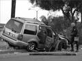
| 12/02/2002 03:48:00 PM |
Don't Drink and Drive by byetkoComment: First before I critique I must ask myself why used without cameras voted this image so low compared to users with cameras. the image is comprised of a vehicle, smashed up, a police officer (I think..) a tree and a few poles. The vehicle's doors are open and there aren't any passengers from what I can see. The whole front end is smashed up esp on the right side. The right tire appears to be either turned so I cannot see it or it is missing altogether. The officer is just looking at the damage with the papers at his side. I find the two poles to be extremely distracting as they oppose the general flow of the picture. i.e. the flow goes from left to right on a horizontal plane ending with the officer at the extreme right side. The poles interfere with the flow as they cut directly into the vehicle on a vertical axis. (do you understand?) The open doors suggest there were at least 3 passengers (though I could be wrong) What would possess two other passengers to get into a car with a drunk? Or to let him drive in the first place? Technical... The exposure is done fairly well although I would have liked to see a bit more contrast.. the chrome should appear to be lighter with a few specular highlights (pure white). Even though there are a few things that could be improved it's definitely worthy of top 10 |
 Photographer found comment helpful. Photographer found comment helpful. |
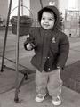
| 12/02/2002 04:22:00 PM |
Sharing Is Caringby indigo997Comment: I think this is a well deserved 11th place finish! And though I have a biased point of view I dont think I would bump any of the top 10 pictures to make this image place "much higher". 11th place is a VERY respectable finish! Very cute kid btw I love the chubby cheeks! |
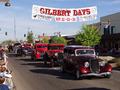
| 12/02/2002 03:56:00 PM |
Gilbert Days Paradeby rcrawfordComment: The first thing I ask myself when I see this picture is "Why is everything red? is it because the town's "colour" is red? or did it just happen that way?" It works in this case though because it fuirther aids the leading line from the bottom right to the middle left. I see bystanders only on the left side, which is fine. The cars are sharp (from what my monitor shows me). It's also nice that the cars are at almost the same distance in the picture.. and old cars are so cool to look at!!! I find the bell shaped object at the top left to be really distracting as well as the traffic lights at the back... Not much you could have done about the lights.. but the bell thing could have been cropped out. Overall the colour and exposure looks good. Good job! |
| Photographer found comment helpful. |
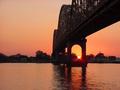
| 12/02/2002 04:06:00 PM |
Sunsetby LanaComment: The first thing that I see when I look at this picture is 1/3 of the image really not occupying very much. There is a lot of weighting on the right side and it makes the image look lopsided. It is a very pretty sunset shot with a bridge.. and sunset shots are only effective with a nice foreground and you achieved that here... I just dont see the relationship between the bridge and photojournalism. If you were deadset on using this particular bridge for whichever reason, I would suggest a different angle.. a little farther to the left would have greatly improved this shot. You miss out on a lot of the architecture of this bridge because it's got a compressed perspective. You would have also gotten better composition moving to the left a bit more because you'd be filling the frame a little bit more and your image would look more evenly spaced. Regardless it's a nice attempt at a bridge/sunset picture! not bad at all! |
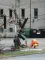
| 12/02/2002 07:18:00 AM |
Storm Destroys Powerlines, Trees.by BigSmilesComment: Naw I wish I could have gotten a little bit closer. Unfortunately for me there was yellow tape everywhere as there were several trees that had fallen over on top of cars and houses. While i agree another angle may have eliminated some of the background distractions, it just wasn't possible at the time. I have a few other shots I was considering.. I'll post them later today. |
| 11/18/2002 08:08:00 AM |
|
| 11/18/2002 07:50:00 AM |
|
| 11/18/2002 07:48:00 AM |
|
| Photographer found comment helpful. |
| 11/18/2002 07:58:00 AM |
|
Home -
Challenges -
Community -
League -
Photos -
Cameras -
Lenses -
Learn -
Help -
Terms of Use -
Privacy -
Top ^
DPChallenge, and website content and design, Copyright © 2001-2025 Challenging Technologies, LLC.
All digital photo copyrights belong to the photographers and may not be used without permission.
Current Server Time: 08/21/2025 03:42:03 PM EDT.