| Image |
Comment |
| 07/22/2004 08:18:35 AM |
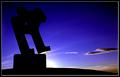
making balanceby JohannesFrankComment: This is a really inspiring image. The subject looks quite monolithic which gives the image an almost science fiction type feel. The composition is stunning with the cloud where it is and the use you have made of the light is very clever. This would make an excellent poster. |
 Photographer found comment helpful. Photographer found comment helpful. |
| 07/22/2004 08:14:36 AM |
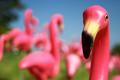
... on one leg ...by GordonComment: Really cool use of the subject matter. The colours are awesome. The composition is excellent. There is nothing subtle about this and it works really well. Even the seam down the middle of the flamingo's head adds to the "drama". I wouldn't hang it on one of my walls but I'm sure there's a night-club or trendy cafe that would. Well Done. |
| Photographer found comment helpful. |
| 07/22/2004 08:09:51 AM |
human balanceby brunasComment: This shot creates a really idyllic sence of ballance. The composition really helps to push the subject matter. The colour and lighting are almost surreal in nature. A beautiful image. |
| Photographer found comment helpful. |
| 07/22/2004 08:05:31 AM |
Balanceby Godive30Comment: Great lighting. I like the central composition. I would have left a little more sky on the top. |
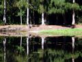
| 07/22/2004 08:02:45 AM |
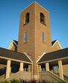
Long Way To Goby Links 2 3 4Comment: Very interesting shot. The lighting and focus are excellent. I would have cropped this image in about 2 inches all the way around. This would remove the foreground trees and make the subject look like a giant against the sky and the houses. Great shot though. |
| Photographer found comment helpful. |
| 07/22/2004 07:59:25 AM |
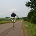
Going for the record!by ConcreteDonkeyComment: Awesome lighting and depth of field. The colours and light on the guy in the background are sublime. Personally I think a little more black space on the right wouldn't hurt. I think this one is up there with the best for this challenge. |
| 07/22/2004 07:55:08 AM |
Nature's Balancing Actby LVEComment: Great idea and beautiful image. All I could suggest is that perhaps a simple border might work well to help "contain" the subject matter. |
| Photographer found comment helpful. |
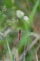
| 07/22/2004 07:52:49 AM |
Red Dragonby cainnComment: Lovely image. I think this image could have been cropped alot closer around the dragonfly. |
| 07/22/2004 07:51:21 AM |
Balanced Compositionby C-town driverComment: Great depth of field and lighting. I think a bit more white space above and below would balance the image a bit more. I also think that large foreground subjects generally sit better when the image has some sort of border. |
| Photographer found comment helpful. |
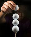
| 07/22/2004 07:48:39 AM |
Balanced Imbalanceby adineComment: Really cool image. Somehow the bottles almost gain "personalities" due to the way you set them up. It reminds me of old cartoons where little guys easily pick up great big bad guys. There's something delightfully quirky about the image. I think a little more white space too the right may have helped just a bit to add a bit more quirkyness. |
| Photographer found comment helpful. |
Home -
Challenges -
Community -
League -
Photos -
Cameras -
Lenses -
Learn -
Help -
Terms of Use -
Privacy -
Top ^
DPChallenge, and website content and design, Copyright © 2001-2025 Challenging Technologies, LLC.
All digital photo copyrights belong to the photographers and may not be used without permission.
Current Server Time: 08/21/2025 12:01:57 AM EDT.