| Image |
Comment |
| 09/18/2005 04:54:34 PM |
|
 Photographer found comment helpful. Photographer found comment helpful. |
| 09/18/2005 04:53:39 PM |
|
| Photographer found comment helpful. |
| 09/18/2005 04:50:59 PM |
|
| Photographer found comment helpful. |
| 09/16/2005 11:01:45 PM |
|
| Photographer found comment helpful. |
| 09/16/2005 11:00:49 PM |
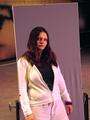
Moodyby kevrobertsonComment: Some nice setup - It this a mirror? Initially looked like she's standing in front of a canvas, but the clipped hand appeared strange.
Nice portrait!
|
| Photographer found comment helpful. |
| 09/16/2005 10:51:41 PM |
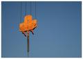
Sky Viewby ArtanComment: Critique Club
First Impression:
Nice minimalisitic photograph.
Nice contrast in color.
A bit flat in processing.
Composition
I like how its off centre horizontally. A different vertical crop might look better - perhaps place the central object in the lower third. Maybe even crop closer to make the subject a bit larger.
Processing
You mention that you slightly desaturated the orange. It seems a little too flat now. Maybe boost the orange saturation back up a little. Also, could sharpen some more.
Good luck in the future!
|
| Photographer found comment helpful. |
| 09/16/2005 03:51:05 AM |
Rise aboveby jmleliiComment: Greetings from the critique club
First Impression:
Composition is busy, uncomfortable tilt in the horizon.
Relevance to the challenge:
I see you were trying to contrast the yellow flowers to the blue sky, which is a good idea. It might have helped to boost the yellow saturation to make it stand out more
Composition:
You could've got a nice yellow-blue contrast with a much tighter crop. The trees behind the flowers dont seem to add much to the photograph.
Camera work:
The depth of field appears too deep. A smaller aperture would have been sufficient.
Processing:
The colors are a bit on the dull side. Boosting the saturation woul've helped.
Good luck in future challenges!
|
| 09/15/2005 09:57:58 PM |
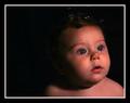
Bubbles? My Bubbles!by SchuffComment: Wow! Nice sharp portrait. Not too sure about the crop - the negative space might have been better on the right. Good luck
|
| Photographer found comment helpful. |
| 09/15/2005 09:43:07 PM |
Patrickby bicrayComment: Nice sharp portrait. A black background might have additional impact. Good luck! |
| Photographer found comment helpful. |
| 09/15/2005 01:06:47 AM |
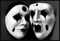
Expressionsby reemasComment: Hello again, this time from the Critique Club
Composition is good, the photograph screams high contrast.
Lighting is just right. I agree it would look better with a black background, esp. when done using layers using bear_music's method.
Deep depth of field works well here.
Overall, I like it a lot, and think it should have placed higher. Keep up the good work!
|
| Photographer found comment helpful. |
Home -
Challenges -
Community -
League -
Photos -
Cameras -
Lenses -
Learn -
Help -
Terms of Use -
Privacy -
Top ^
DPChallenge, and website content and design, Copyright © 2001-2025 Challenging Technologies, LLC.
All digital photo copyrights belong to the photographers and may not be used without permission.
Current Server Time: 08/24/2025 01:52:07 PM EDT.