| Image |
Comment |
| 05/22/2008 09:29:37 AM |
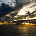
The Matchby vladoComment: I like the color tones, don't remember the movie though. :) |
 Photographer found comment helpful. Photographer found comment helpful. |
| 05/22/2008 09:27:21 AM |
|
| 05/22/2008 09:22:28 AM |
|
| Photographer found comment helpful. |
| 05/22/2008 09:18:27 AM |
|
| Photographer found comment helpful. |
| 05/22/2008 08:44:23 AM |
|
| Photographer found comment helpful. |
| 05/14/2008 08:20:23 AM |
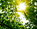
Photosynthesisby bvyComment: Beautiful green tones! :) Very sharp and light. The sunlight falling on the leaves produces an uplifting and joyous feeling. Nice work. |
| Photographer found comment helpful. |
| 05/12/2008 11:24:04 PM |
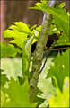
Battle Scarsby crikComment: Originally posted by bvy:
I should have known this was yours! Beautiful greens and yellows as usual, and nice textures too. I might have cropped off some of the bottom (the OOF leaves) but I see that that throws the effect of the framing off. |
Thanks, bvy, and yes, an abundance of greens! Those leaves in the lrc were a little blown out in some spots as well but couldn't crop it differently or dodge it enough to make an improvement.
This anole had an encounter with a stray cat passing through the yard. It was lucky to escape. :) |
| 05/06/2008 11:04:41 AM |
Anole Close upby crikComment: Originally posted by bvy:
Looking at your profile, and at this, I'd have to say greens and yellows are your thing. (I seem to be into dull blues, grays and blacks lately -- what's that say?) Anyway, great capture here and I do love the bright earthy colors. |
You are right about the colors. :) Green actually is my favorite color but -- I've got to get out of my backyard more! ;) The shots in blues and grays that I see in your profile tell me that you use those colors very well. keep up the good work! |
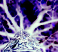
| 05/06/2008 10:41:53 AM |
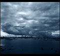
Up A Treeby bvyComment: Nice abstract. The cold blue and icy sharp look of the tree trunk is what makes this one for me.
I agree with bobonacus - too many ones. Message edited by author 2008-05-06 10:43:24. |
| Photographer found comment helpful. |
| 05/06/2008 10:32:02 AM |
The Cathedralby crikComment: Originally posted by bvy:
No comments? I like this -- especially the clean lines and geometry of the building, and the chocolate tones. Maybe more contrast in the sky would have helped, but what do I know about negative? I did abysmally in this challenge. |
Thanks, bvy. This challenge was an interesting experience. I agree with you about the sky - some contrast would have helped. I was wishing there had been a cloud or two in the shot. :) |
Home -
Challenges -
Community -
League -
Photos -
Cameras -
Lenses -
Learn -
Help -
Terms of Use -
Privacy -
Top ^
DPChallenge, and website content and design, Copyright © 2001-2025 Challenging Technologies, LLC.
All digital photo copyrights belong to the photographers and may not be used without permission.
Current Server Time: 08/15/2025 01:38:46 AM EDT.