| Image |
Comment |
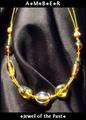
| 04/29/2005 10:07:57 AM |
Amberby DustDevilComment: The fold in the fabric is distracting to me, as it seems as though it is hiding something. Perhaps if this necklace were photographed around someone's neck, it would have been more pleasing. The amber looks a bit washed out to me, but overall, it has a nice color. Also, it appears to be glowing - nice touch. |
 Photographer found comment helpful. Photographer found comment helpful. |
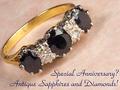
| 04/29/2005 10:05:37 AM |
Sapphires and Diamondsby hughletherenComment: For me, the rotation of the ring is not fitting for the ring itself. Something about this piece of jewelry, in my eyes, calls for a basic horizontal orientation. Other than that, I would like to see the sapphires a bit lighter. I like your choice of background surface, though. |
| Photographer found comment helpful. |
| 04/29/2005 10:00:58 AM |
Iceby bruskiComment: Wonderfully professional. Great depth of field. Nice color choice for the font - mirrors the stone and doesn't distract the eye. This should do well. |
| Photographer found comment helpful. |
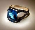
| 04/29/2005 09:59:42 AM |
Topazby aerogurlComment: The overall photo is a bit dark for my tastes. If the background were pure white, I think it could add even greater emphasis to the ring. The color in the topaz is very beautiful, though. |
| Photographer found comment helpful. |
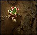
| 04/29/2005 09:57:11 AM |
|
| Photographer found comment helpful. |
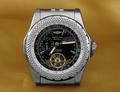
| 04/29/2005 09:55:04 AM |
Bentleyby ChinabunComment: Good job managing the reflections, and it looks like you even desaturated the reflections in the watch (either that or you colorized the fabric), or your watch is so expensive that it only reflects in that nice silvery color. As far as the photo, it is very sharp, but the composition is a little stagnant with the watch being centered. I'll be utterly nit-picky and say that I wish the hands of the watch had a different orientation. By the way, how many years did you have to go to school to learn how to fully utilize this watch? |
| Photographer found comment helpful. |
| 04/29/2005 09:50:35 AM |
Take the Leap: Buy Me!by dsidwellComment: Great idea and nice composition. It seems that the highlights on the gold area bit harsh. Still, this is quite magazine ad-esque. |
| Photographer found comment helpful. |
| 04/20/2005 04:19:52 PM |
War of the Tacksby sofapezComment: What are these tacks stuck to? It looks like skin, but I'm not sure which part... |
| Photographer found comment helpful. |
| 04/20/2005 04:18:46 PM |
A work in progressby LesleyNelsonComment: Looks like a mushroom cloud from an atom bomb. So, did you run out of time on the challenge half way through your in-fill? |
| Photographer found comment helpful. |
| 04/20/2005 04:14:09 PM |
Oopsby ArcyComment: Strange how the desat makes the tack look like it's glowing...unless you did that on purpose. Who knows. I like that most of the image is blurred aside from the tack, but it seems like post-processing and seems over the top. |
| Photographer found comment helpful. |
Home -
Challenges -
Community -
League -
Photos -
Cameras -
Lenses -
Learn -
Help -
Terms of Use -
Privacy -
Top ^
DPChallenge, and website content and design, Copyright © 2001-2025 Challenging Technologies, LLC.
All digital photo copyrights belong to the photographers and may not be used without permission.
Current Server Time: 08/05/2025 04:50:37 AM EDT.