| Image |
Comment |
| 06/13/2006 05:17:26 AM |
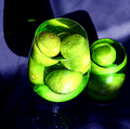
Neon Limesby mambaComment: The harsh light and some window's reflects could have been avoided and a black background could have hidden the strong shadows.
Interesting idea ! |
 Photographer found comment helpful. Photographer found comment helpful. |
| 06/13/2006 05:07:46 AM |
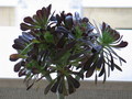
Green Gardenby hrv56Comment: I really like this plant !
You should have tryed to take photos from different angles to avoid the strong lighting , it's hard to see the details of the plant because of the shadows. |
| 06/13/2006 04:43:33 AM |
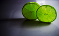
Twin Greenby digital-infinityComment: Nice slices of lime but you could have prepared a little better the set up and the lighting to avoid the strong shadows and the reflections from a window (I suppose). |
| Photographer found comment helpful. |
| 06/13/2006 04:38:30 AM |
downward crawlby zarzoComment: I think you could have scored higher with a better lighting , I imagine this shot without the spot light on the apple , could have been really nice.
I like the composition , the contrast between the brown and green works great. |
| Photographer found comment helpful. |
| 06/13/2006 04:34:42 AM |
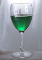
Mondovi Greenby NoellaSueComment: As it's basic editing , you should have been more careful with the choice of the different elements and the composition : the cloth under the wineglass , the background with wrinkles , the distracting reflects on the glass (from a window I suppose).
The idea is good , I like the decorated glass but you should have prepared better the set up. |
| Photographer found comment helpful. |
| 06/13/2006 03:42:22 AM |
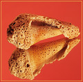
Naturally Textured - Take IIby DigiFotoBuddyComment: From the Critique Club :
Hi Shailesh ,
Comparing with  , I think that Naturally Textured - Take II fits much better a Textures' challenge.
The focus is great on the shell and on its reflection , really much better ; the details are very sharp.
Personally I prefer the first background , it's more neutral , maybe even less appealling at a first sight but orange/redish and sand color don't work too well together (imho).
Noise is visible too in this version and about the border , I have noticed that many voters/viewers generally don't appreciate borders.
Lighting is good , better than in the first one (no strong shadows , more natural look).
I agree with Neuferland you truly have improved your shot !
Please feel free to email me about this critique.
Mambe |
| Photographer found comment helpful. |
| 06/12/2006 11:04:47 AM |
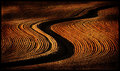
Farm Zenby tonyvComment: Interesting study ! I like the warm tones. |
| Photographer found comment helpful. |
| 06/12/2006 08:32:59 AM |
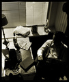
Noirby AghrisComment: Noir et plein de charme...
Like a scene from a detective movie of the 50's , I love how you have recreated the atmosphere , the face hidden by the shadows only adds more mystery. |
| Photographer found comment helpful. |
| 06/12/2006 07:22:52 AM |
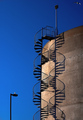
Double Helix by jdannelsComment: Very nice effect ! It's a nice composition with the contrast between a great blue sky and the concrete of the building. |
| Photographer found comment helpful. |
| 06/12/2006 07:16:23 AM |
|
| Photographer found comment helpful. |
Home -
Challenges -
Community -
League -
Photos -
Cameras -
Lenses -
Learn -
Help -
Terms of Use -
Privacy -
Top ^
DPChallenge, and website content and design, Copyright © 2001-2025 Challenging Technologies, LLC.
All digital photo copyrights belong to the photographers and may not be used without permission.
Current Server Time: 08/30/2025 11:35:02 AM EDT.