| Image |
Comment |
| 11/24/2004 01:14:02 AM |
The Foley's - Authority on Antiquesby Prof_FateComment: I really like so much about this image that I wish that your subjects weren't so dead center. Nice images behind your subjects on the left of the frame. The right side doesn't work as well for me. The older woman's expression is priceless. I think I would have moved them back and had them surrounded by their wares. |
 Photographer found comment helpful. Photographer found comment helpful. |
| 11/24/2004 01:09:55 AM |
medical authorityby ssenguptaComment: Nice use of line and contrast of line. The shiny clean image certainly match the image of the Mayo clinic I have in my mind's eye. The brilliant blue sky and the shiny metal work so well together. It is rather dizzying, though, which counters the idea of stability I have when I think of the Mayo Clinic. It does give a sense of limitless possibility, so I guess it does work well. I just to have to step back and let go of my preconceived ideas. Nice photo. |
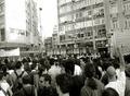
| 11/24/2004 01:06:44 AM |
people vs authorityby akyrosComment: Good idea, but choose a focal point. Not all the people seem engaged in challenging whatever is going on. The police or soldiers are hard to see, and I am unsure what they are doing. I would focus on bald man in the white t-shirt. His stance and physical appearance are certainly challenging. He makes a great image. The man in the sunglass distracts from your intent because he seems unconcerned. |
| 11/24/2004 01:02:07 AM |
the Bossby jmritzComment: Startling in the starkness and then brilliant color. I want something more, maybe the subject's head turned a bit, or less negative space, maybe more contrast in the colors that are there. |
| Photographer found comment helpful. |
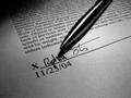
| 11/24/2004 12:57:30 AM |
Fingertip Authorityby bigfishComment: Nice use of light and shadow. Great clean lines in the crisp focus, letters, and pen. I would have angled the pen from the other upper corner so that the signature was not obscured by the shadow from pen. The artist did an excellent job by choosing to make the letters so clear and tight at the bottom of the page and then sliding out of focus as they move up the page. Outstanding choice of angle for that aspect. Great image. |
| Photographer found comment helpful. |
| 11/24/2004 12:54:18 AM |
Tybee Lightby ejonesComment: Such vibrant colors and clean lines; however, the images compete for dominance. I would change the angle and point of view to let one complement the other, and let one take center stage. The lines of the lighthouse and the fact that the flag is blowing toward the right frame gives this image a feeling of power and hope. |
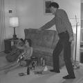
| 11/24/2004 12:50:52 AM |
Don't do that at your age ! ! !by yomanComment: Good use of framing and angle to create the image of one subject towering over the other. The lighting and focus are a bit off. I would like to see facial features for some sort of emotion to pull me in. Again, the power of this photo is how artist used angle and point of view to give the sense of one subject trying to impose his authority over another. It meets the challenge in that way very well. |
| Photographer found comment helpful. |
| 11/24/2004 12:47:35 AM |
Demanding your presenceby panoramixComment: Great long, elegant lines in this hand. The curve on the ring really complements that. I don't like the color of the background. I am unsure what color would be better, but white diminishes rather than showcases your subject. Great concept, creative and interesting. |
| Photographer found comment helpful. |
| 11/24/2004 12:45:26 AM |
The Highest Authority?by RussComment: Indeed. Nice lighting on the bible and crucifix. The harsh lighting on the candle(?) is distracting for me. I would crop it out and let the power of your main images take centerstage. Really beautiful lighting on the apex of the curve on each page. Stunning image without the distraction from the top. |
| Photographer found comment helpful. |
| 11/24/2004 12:41:34 AM |
The King of His Domain by LegatoMuzicComment: Powerful image. Great angle and crisp image with a soft background, which works well. I would like to see a greater contrast, blacker blacks and pinker pinks. |
Home -
Challenges -
Community -
League -
Photos -
Cameras -
Lenses -
Learn -
Help -
Terms of Use -
Privacy -
Top ^
DPChallenge, and website content and design, Copyright © 2001-2025 Challenging Technologies, LLC.
All digital photo copyrights belong to the photographers and may not be used without permission.
Current Server Time: 08/02/2025 06:58:38 AM EDT.