| Image |
Comment |
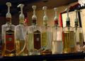
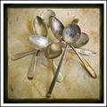
| 12/01/2004 12:49:56 AM |
Starbucksby eugeneComment: Technically a very nice shot. It is hard to get a focal point with seven objects. I wonder is the impact would have been even better if all the labels were turned toward the viewer. |
 Photographer found comment helpful. Photographer found comment helpful. |
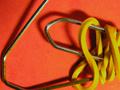
| 11/30/2004 01:09:08 AM |
Rubber & Steelby phobdenComment: Nice contrast of textures and shapes, the rigid bends of the paperclip and the elegant curves of the rubberband complement each other well. I would like to see the shadow underneath the objects eliminated but not the shadow on th rubberband. This is a nice shot. |
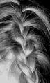
| 11/30/2004 01:07:30 AM |
Braidby vtruanComment: Simple and elegant idea. Clean up the stray hairs and maybe burn the neck so that it doesn't look so blown out. |
| Photographer found comment helpful. |
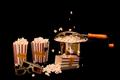
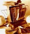
| 11/30/2004 01:06:32 AM |
Stove-Top Popcorn Popper and 3D Glassesby stupidcatComment: Great idea and use of color. I just so want that popcorn that is in the air to be crisp and tightly focused. That would make this image rock. The framing is a little too much in the center for me. I would play around with the cropping to see what creates the most energy and evokes the most interest. |
| Photographer found comment helpful. |
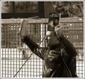
| 11/30/2004 01:03:43 AM |
Reading Books... Low Tech but still fundamentalby jmleliiComment: This image looks to me like the man is protesting something. I get the feeling of banning or burning books for some reason. I think that it is his expression and that he is facing left, which could simply mean that he is looking back to the past when people read more. It is his expression that throws the image for me. |
| 11/30/2004 01:01:43 AM |
|
| 11/30/2004 01:00:47 AM |
Remember The Slide Rule?by SammieComment: These things amaze me. It blew me away to watch them use slide rules on Apollo 13. The convenient carrying case is a perfect element, as well as the graph paper background. The X shape of your subjects is also linear and mathematical. A great deal of thought went into this shot. I would have liked to see all the shadows eliminated so that it appeared even more clean and polished. |
| Photographer found comment helpful. |
| 11/30/2004 12:58:17 AM |
Vintage Toastby SweetlipsComment: Great idea. The image is a little too cluttered for me; it takes away from your main subject. The old toaster, some toast and some crumbs would have sufficed. I like the monochromatic orangish-hinting-at-sepia but a tad more edgy hue. I like the origin of your light source. Since it comes from the left, it evokes the feeling of morning for me, which goes well with your image. |
| Photographer found comment helpful. |
| 11/30/2004 12:55:11 AM |
High Keysby TuckersmomComment: Nice double entendre with your title. I like this image. It is creative, edgy, and risky. It also shows intelligence. Very refreshing. There is a little too much white space at the tope of the image for me. It gives me a sense that the image is somehow falling. Other than that smidgen of a complaint, stunning image. |
| Photographer found comment helpful. |
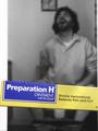
| 11/29/2004 11:49:11 PM |
Humour is in the seat of the beholder...by grandmarginalComment: Okay, more toilet humor. I just sorta feel sorry for the guy. The positioning and facial expression make this a little too real to be funny. I feel a bit like I am violating the subject's personal pain. |
Home -
Challenges -
Community -
League -
Photos -
Cameras -
Lenses -
Learn -
Help -
Terms of Use -
Privacy -
Top ^
DPChallenge, and website content and design, Copyright © 2001-2025 Challenging Technologies, LLC.
All digital photo copyrights belong to the photographers and may not be used without permission.
Current Server Time: 08/04/2025 10:01:11 PM EDT.